UX vs. UI Design: What’s the Difference?

With proliferation comes specialization.

In other words, the greater the demand for something, the more that thing will be reduced into meaningful divisions. We see this in all manner of technological advancement.

Take, for instance:

  • Firearms: Centuries ago, the earliest firearms were manufactured at a single point of origin. As the demand for guns increased, specialization increased. Recently, I met a gentleman employed by a manufacturer whose entire business is the production of metal components used exclusively in the firing mechanism of handguns.
  • Hand Tools: For millennia, humans have developed simple machines in the form of hand tools. In early history, these tools were few, but as demand for them increased, the specialization of tools increased. Today, I have a friend who works for a company with an entire division devoted to the manufacture and sale of specialty plumbing tools like those that give fire departments access to water at fire hydrants. These tools are used for no other purpose than this specialized application.
  • Vehicles: Motorized construction vehicles are a relatively recent technological advancement in history. Even still, as demand for such vehicles increased, so did the specialization of their manufactured parts. Today, I have a friend who works for a company whose entire business is manufacturing and selling ball bearings used by major construction vehicle manufacturers like Caterpillar.

With proliferation comes specialization.

Not that long ago (within the past 20 years), getting someone to build your website usually meant finding a one-person band. They could design, write, and provide site support services like domain and host registration and even code. These folks were often called “webmasters.” They were jacks-of-all-trades but masters of none.

But as the demand for complexity and quality of websites has increased, so has the number of supporting specialty disciplines. Today, the most professional, usable, and impressive websites are often the result of collaboration between dedicated marketing strategists, digital marketing analysts, designers, copywriters, front-end developers, back-end programmers, and cloud-based support services offered by companies like GoDaddy.

The user experience (UX) and user interface design (UI) disciplines are among the more recent specialties to emerge.

What is UX Design?

The work of the UX designer is generally not what most laypeople think of when they think of a web or digital designer. When they talk about hiring a designer, most people think about someone who can create or direct the artistic style or distinct visual components of a digital product. This is more akin to UI design, which we will discuss in more detail later.

UX Design is primarily concerned with process or journey. And although the deliverables of UX design are indeed digitally tangible, it’s highly conceptual. It’s concerned with questions, psychology, behavior, and yes—experience. As its name indicates, a UX designer has the role of crafting a user-centric digital experience with the aim of eliciting particular sentiment(s) and action(s).

The role of a UX designer is similar to that of a residential architect—planning and scheming the use of space, emphasizing certain features over others, creating a natural flow for the unique living habits of the homeowner, and deciding which home elements go here rather than there. However, to do this effectively, an architect must know and understand the homeowner and deliver a blueprint that facilitates an authentic, functional, and bespoke experience. This is UX design, in parallel.

UX Goals
The goal of the UX design of a website or digital product is concerned with at least the following outcomes:

  • Ease of use
  • Intuitiveness of experience
  • Consistency of presentation
  • Clarity of calls to action
  • Unimpeded conversion process
  • Cultivation of user habit

UX Considerations
To reach these goals, the UX designer asks the following types of questions and many more:

  • What is the website’s goal (to inform, showcase, funnel, convert, etc.)?
  • Who do we expect to use the website, and what do we know about these individuals? Are there meaningful subsets or audience segments within this range of users?
  • How do we get users to perform action X?
  • Which page(s) will lead users to the desired action, and in what order?
  • What information is visible on the screen at any given time?
  • What type of scrolling experience should accompany the site (long, fixed, infinite, parallax)?

UX Deliverables
UX design aims to deliver wireframes and prototypes resulting from its work. A particular phase of a project may require different levels of sophistication within the deliverable spectrum:

The UX Deliverable Spectrum.

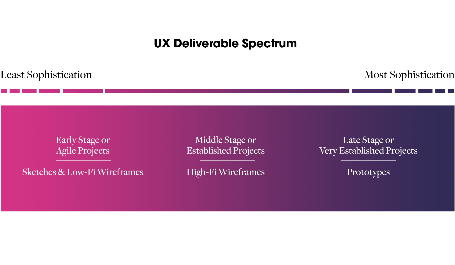
Low fidelity or “low-fi” wireframes can be simple sketches, whiteboard diagrams, or intentionally underdeveloped wireframes created in design software. Low-fi wireframes can be extraordinarily helpful in the early brainstorming stages of a digital product. They provide working groups with quick, visual depictions of how the product should work, yet they are easily altered to accommodate new data and ideas. Low-fi wireframes are also effective and may be the totality of UX deliverables for quick-release or agile projects that are still in a high degree of flux.

Low-fidelity wireframes.
Low-fidelity sketches/wireframes.

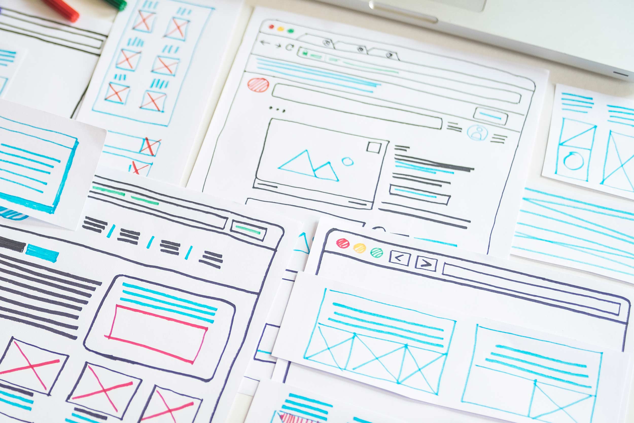
Don’t be fooled by the lack of polish; whiteboarding at the hands of an experienced professional can be incredibly valuable. However, herein lies the double-edged sword of UX design: the less sophisticated end of the deliverable spectrum is accessible to almost anyone without formal training, but this invites generalists or inexperienced people into the fray.

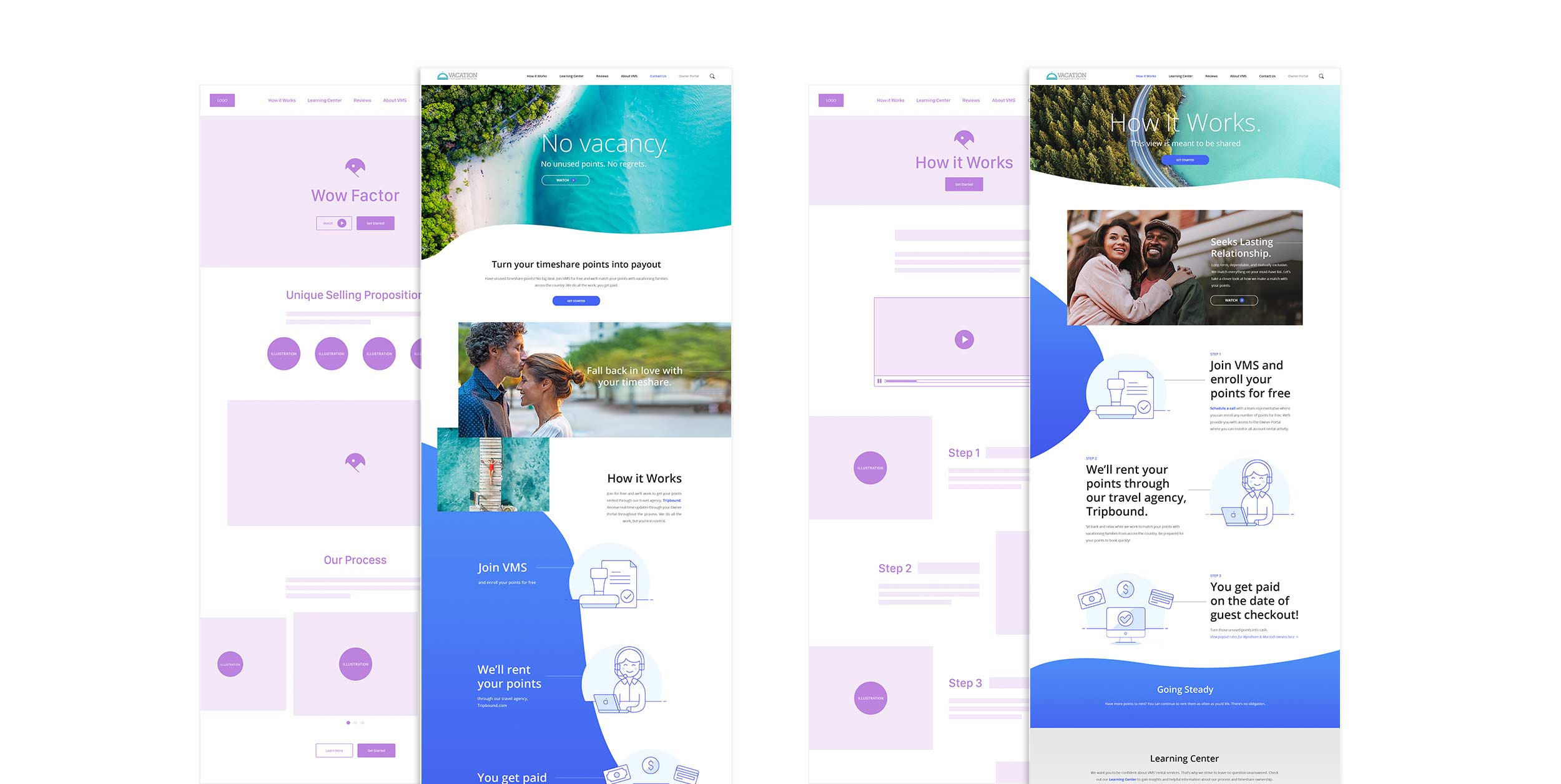
High-fidelity or “high-fi” wireframes are usually grayscale images of product pages. These pages demonstrate what content appears within the digital product and where. Details regarding placement of copywriting, buttons, and the intentional flow of information are all included in high-fi wireframes.

High-fidelity wireframes.
High-fidelity, grayscale wireframes. 

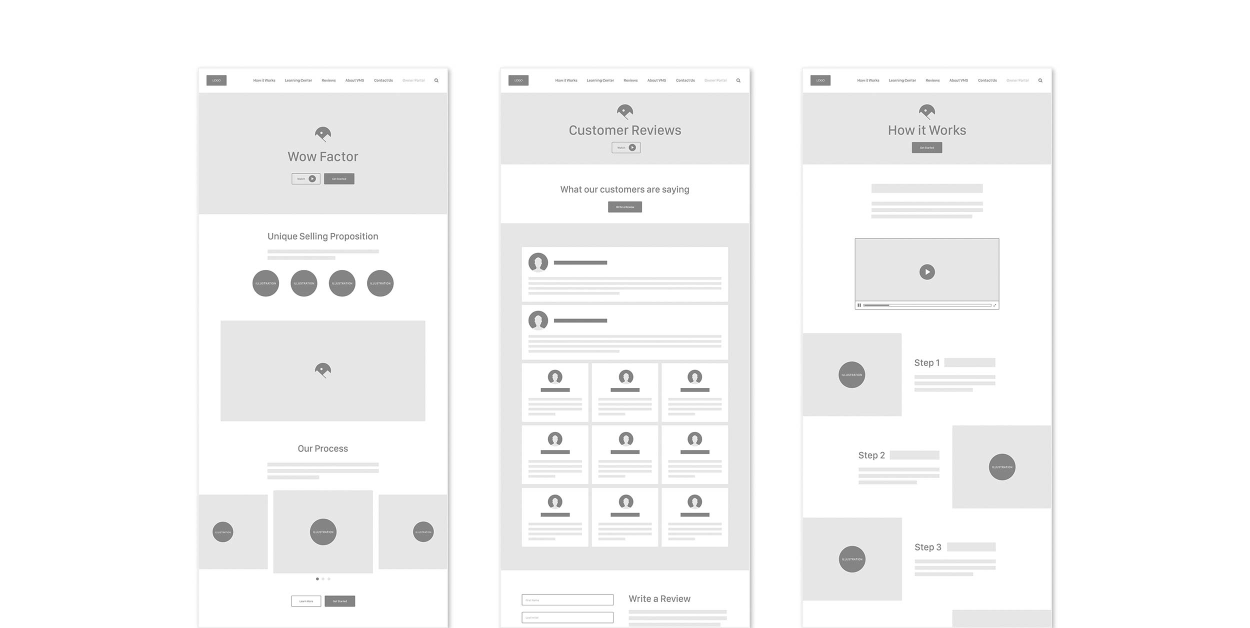
High-fi wireframes resemble polished architectural schematics. They are neat, clear, and organized, offering essential guidance for the user journey.

Prototyping
The most advanced development of UX design takes the form of prototypes. Prototypes are interactive wireframes, demonstrating the user journey flow. Prototypes will often contain every possible page type or screen view within a digital product. They will model the audience (or user segment, called a persona) journey through the product’s experience.

UX Tools
Obviously, when fashioning sketches or low-fi wireframes, any combination of utensil and canvas (pen and paper, dry erase marker and whiteboard, stylus and app) will do. However, the production of high-fi wireframes and prototypes requires sophisticated software.

As of 2020, a survey of UX and product designers indicated that Figma, InVision, Adobe XD, and Sketch represent the top tools of choice. These tools, and many others, are equipped with robust brainstorming, flowcharting, wireframing, prototyping, and even UI design functionality. The essential functions within these tools can be learned within a few short hours; mastery of their full capabilities can take many months of dedicated, daily time and experimentation.

Colour Outside’s UX product of choice is Figma.

What is UI Design?

Contrary to the work of the UX designer, the work of the UI designer is generally what most laypeople think of when they think of a web or digital designer. This is because UI designers create or direct a digital product’s artistic style or distinct visual components.

UI Design is primarily concerned with aesthetics. However, as we often say at Colour Outside, it’s not enough to look pretty. Many people in the world can create something pleasant to look at. But few people can create something pleasing to look at that also proves functional. So the UI designer has the role of building on the work of UX design to fashion elegant, consistent, on-brand, and user-centric aesthetics.

UI Design Success Spectrum

Continuing with our residential design analogy, the role of a UI designer is similar to that of an interior designer or decorator—bringing the homeowner’s personality (brand) to bear on the project, selecting surfaces and styles that complement one another and that create a feeling, and discriminately highlighting statement pieces within the home while introducing subtlety to others.

UI Goals
The goal of the UI design of a website or digital product is concerned with at least the following outcomes:

  • Accurately applying the brand
  • Delivering a beautiful, elegant experience
  • Consistency of presentation
  • Successful visual hierarchy (drawing the most attention to critical elements and less attention to others)

UI Considerations
To reach these goals, the UI designer asks the following types of questions and many more:

  • What are the established brand assets (colors, typography, visual motifs, etc.), and are they comprehensive enough for this project?
  • Which colors, font weights, font sizes, and line heaviness (thickness) will establish the best visual hierarchy?
  • How do we draw the most attention to X and less attention to Y without losing Y altogether?
  • What visual motifs can we introduce to deliver a compelling and memorable product?

UI Deliverables
UI design aims to deliver mockups as the result of its work. Mockups are fully-designed, static images of product pages or screen views.

Mockups
Mockup examples.

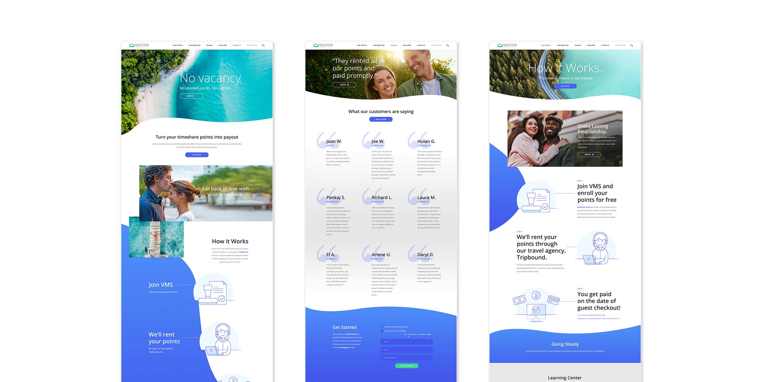
Because providing mockups can be time-intensive, design teams will often mock up the least amount of content possible to specify aesthetics for all possible content. For example, if two pages on a website use an identical design, differing only in photography choice and copywriting, one mockup will suffice. The single mockup provides design direction for a page type, which is sufficient for quality execution of the project. Engaging a UI designer’s time mocking up all possible variations of copywriting and imagery within a single page type or view is a waste of valuable personnel resources.

UI Tools
Unlike UX design, there is no meaningful version of UI design that can be done without sophisticated software or the power of web applications.

Referencing the same design survey we linked to earlier in this article, Figma, Sketch, Adobe XD, Adobe Illustrator, and Adobe Photoshop represent industry professionals’ top tools of choice. Each of these tools, and many others, are equipped with seemingly limitless UI design functionality. Like UX software, basic functions within these tools are quickly attainable, but expert skills require a considerable investment of time.

UX/UI Design

Far more powerful than UX or UI design on its own is the combination and coordination of these two design sub-disciplines.

Wireframes and coordinating mockups.

Interactivity
At Colour Outside, we’re committed to developing and deploying cutting-edge digital products that represent the most recent technological advancements in the industry. As standard internet speeds have grown more rapid and the average device more sophisticated, we have witnessed the advent of digital interactivity design.

Interactivity design is the design of dynamic or animated elements within a digital product. Interactive elements animate upon an action such as a page load, arrival at a juncture via scrolling, or a mouse hover.

In the past, these elements were typically the purview of a UI designer. However, as they have become more common, more specialized interactions have been introduced (with proliferation comes specialization). These more sophisticated interactions now bridge the gap between UX and UI design. Because interactivity can be used in the service of the user journey and not just aesthetics, interactive design works best as the shared purview of UX and UI designers.

At Colour Outside, we now have a design stage for our digital products that focuses just on product interactivity specifications.

Design Professionals

If you’re looking to hire a designer or enter the design field as a professional, there are generally three different roles that pertain to UX and UI design:

  • UX Designer or Product Designer
  • UI Designer
  • UX/UI Designer

Many large, complex organizations will parse out UX and UI design roles, staffing their marketing teams with dedicated specialists in these two sub-disciplines. However, the most experienced design professionals within these organizations (and those within smaller organizations or in organizations without the budgets or need for such specialization) will represent a combined role: the UX/UI designer.

Conclusion

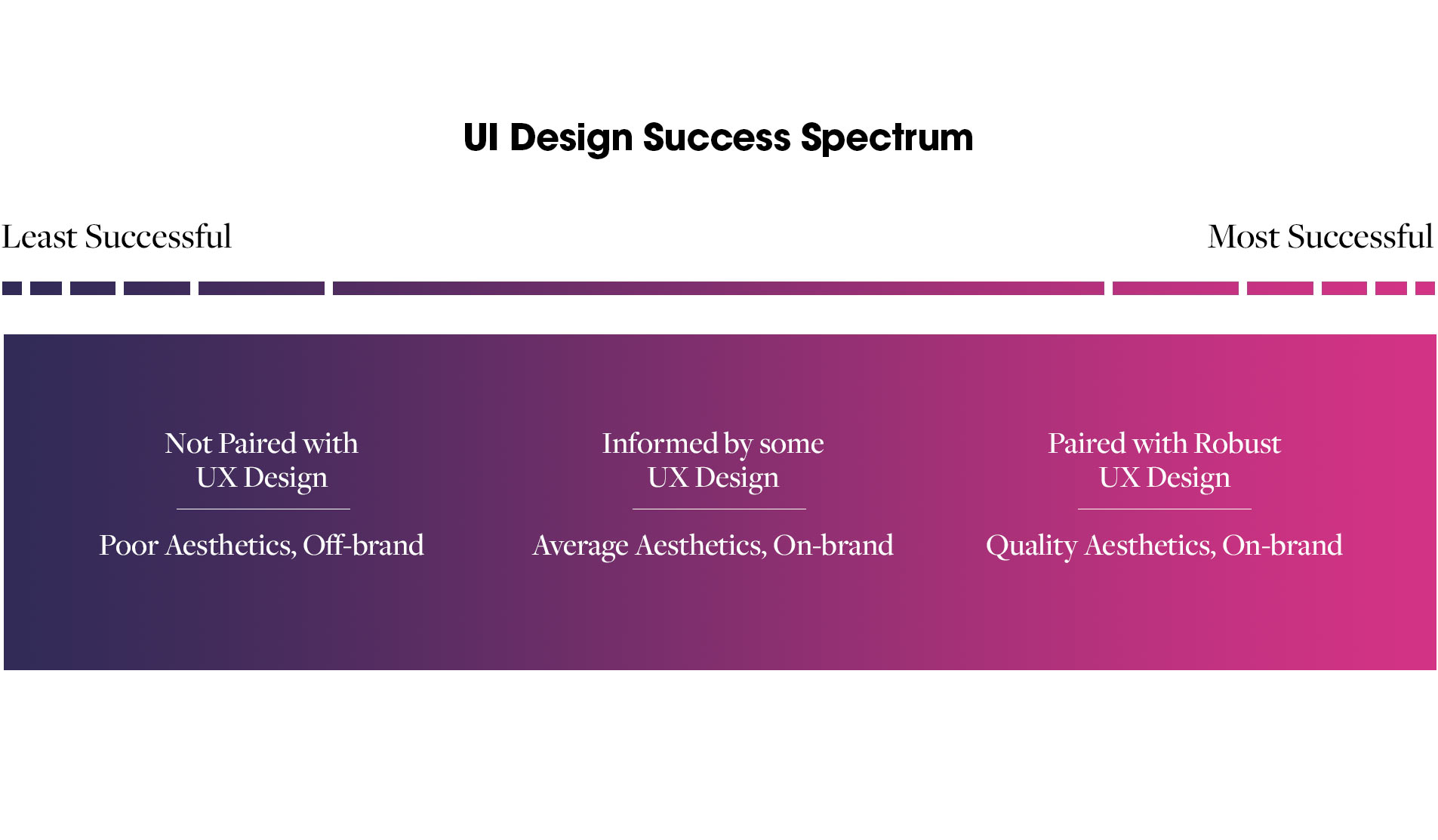
Design suffers from critique as a spectator sport in that most people think they possess some design sensibility and are therefore tempted to put their opinions on par with an experienced professional. However, experienced UX/UI designers are worth their weight in gold, as they can provide expert guidance and beautiful, elegant solutions for digital product creation.

Colour Outside is home to some of the best UX/UI designers in the industry, rivaling the work quality of major agencies and the product divisions of recognized digital technology brands.

Contact us for a free consultation or to begin a project today.

Justin Schoonmaker

We Rebranded! No, You Just Unveiled a New Logo

Of all the common misconceptions about branding, the most prevalent is the notion that your logo is your brand.

A few years back, a friend of mine who pastors a church in Virginia came to me and proudly announced, “We’re rebranding!”

“Oh, yeah?” I replied.

“Yeah! Wait until I show you the new logo concepts. I think you’ll really like them.”

The logo update came and went, and while my friend’s church had a new sign out front and a new avatar on Instagram, they continued doing what they had always done. Aside from a few compliments on the logo, audience perception of the church did not change. Was this a rebrand? Or just the unveiling of a new logo?

Your logo is not your brand. Your logo is merely one expression of your brand. Why does this distinction matter?

Image result for you keep using that word gif

As long as you continue to think of your logo (or any visual, for that matter) as your brand, you will miss your greatest opportunities for influence. You will hire a designer, print some t-shirts, make some snazzy new business cards, and then after a year wonder why things haven’t changed and business (or membership, or attendance, or whatever you seek) hasn’t grown.

But it doesn’t have to be this way.

Remember, your brand is the gut-level feeling that others have of you or your organization. Additionally, your brand is integrally connected to who you really are. This is why branding efforts that attempt to be something you’re not are ultimately doomed for failure, even if they produce momentary success (Fyre Festival, anyone?).

Image result for fyre festival gif

So a “rebrand” is a series of efforts to change that gut-level feeling in people by changing something about who you really are. A true rebrand by an organization involves a change in mission, a change in service offerings, or a change in a fundamental way of doing things. This change is often accompanied by a creative marketing and communications effort to tell the world about the new you (and this is where Colour Outside comes in).

If you update your logo, but don’t change anything else at a deeper level, you haven’t rebranded. You just unveiled a new logo.

IF YOU UPDATE YOUR LOGO, BUT DON’T CHANGE ANYTHING ELSE AT A DEEPER LEVEL, YOU HAVEN’T REBRANDED. YOU JUST UNVEILED A NEW LOGO.

Think of this in human terms. If a friend of yours who is fun, witty, spontaneous, and blunt gets a new haircut and starts wearing a different style of clothes, she hasn’t really changed your perception of her. Sure, you might consider her a bit more modern, but ultimately she’s the same person to you.

If this friend, however, begins to act serious, becomes more planned and calculated, and is more cautious with her words, you will start to think of her differently. And when she pairs this with her new outfit, you truly perceive her as a changed person.

A logo update is the equivalent of a new outfit for a brand—same person, new look. Brands that have unveiled new logos in recent years (but haven’t rebranded) include Google, Bank of America, and Pepsi. No ostensible change in mission, service offerings, or fundamental way of doing things has occurred. Same organizations, new looks.

Brands that have truly rebranded in the public eye include Chobani, McDonald’s, and Porsche. Chobani has introduced fun and whimsy into their way of doing things. McDonald’s, albeit by a Super Size Me twist of the arm, has begun to change its menu offerings to give customers fresher options. Porsche entered the SUV market despite its ironclad perception as a sports car manufacturer. Perhaps the most interesting thing about this short list is that while all three of these companies have undertaken rebranding efforts, only one (Chobani) has changed their logo to support those efforts. Different organizations, and in only some cases, new looks.

If you look at those two lists of names, it becomes self-evident who has truly “rebranded.” Which of those six companies have you changed your perception of in the past 5-10 years? It’s likely the former three have maintained a pretty consistent place in your gut-level perception, and the latter three have changed a bit (for better or worse).

This is not to say logo changes alone are pointless. Your organization may have a solid brand reputation and you just want to update your old logo to reflect the modern excellence represented by your core business. We’ve helped many clients (e.g. Cornerstone Wealth, Pachacea, etc.) with logo identity development, absent broader branding efforts.

But the more you understand that your brand is about every part of the experience you deliver (and not just your look), the more you will capitalize on truly meaningful points of influence, and the more you will grow your business. And that’s precisely what Colour Outside is here to help you do.

Whether you are looking for a logo update alone, or are looking to comprehensively rebrand, Colour Outside can help. Contact us today to talk to an expert. Or just drop in to deliver some Chobani. We’ll love you forever.

Justin Schoonmaker

The 80/20 Brand Rule

A strong brand is one that resonates. A brand you can feel, yes. But just as importantly, one that makes you want to jump from your chair and shout, “That’s true!”

Sustainability of brand requires authenticity. If you want your brand to last, it must be realistic and it must be true. You can be a flash in the pan by claiming to be something you’re not. But you can’t have long-term success and do the same.

Let’s say you open a coffee shop that sources delicious coffee from Ecuador. You love your coffee and you think the world should know how good it is. But you’re a rookie roaster, and some batches aren’t the best. Moreover, there’s some delicious coffee from Kenya served at the cafe down the street.

You decide to be aspirational in your branding and make the claim that you serve “The World’s Best Cup of Coffee.” But do you really serve the world’s best cup of coffee? You might someday, but you don’t today. And so your top-tier messaging is, if not a lie, 100% aspirational.

Image result for world's best cup of coffee elf gif

This makes for weak branding. The moment you gain a repeat customer, they’ll take a fateful sip of one of your over-roasted batches and find you failing to deliver on your brand promise. You can’t help but disappoint your audience. And word will get out.

The strongest, most sustainable brands–the ones that resonate–employ the 80/20 Brand Rule. This rule states that 80% of your brand identity must be actual and 20% can be aspirational.

80% OF YOUR BRAND IDENTITY MUST BE ACTUAL AND 20% CAN BE ASPIRATIONAL.

This doesn’t have to be exact. It’s difficult to quantify the contribution of a headline vs. a design vs. a paragraph of copy. But when surveying your brand landscape, it should feel about 80% actual and 20% aspirational.

So what’s a better message for your coffee shop? Our killer Content & Brand Strategist, Natalie Harger, could help us craft a winner. But until we get her input for your hypothetical startup, something like “Sourcing quality beans in pursuit of the world’s best coffee” would resonate more.

We should never claim to be someone we clearly are not. This is (hopefully) obvious, right? Those claims are what we call lies.

But the less obvious pitfall is the temptation to claim you already are something you hope to become. While these may not be lies, they will fail to resonate with your audience when you deliver your brand experience.

So don’t be a church with a website proclaiming how welcoming you are when people can attend a service without being greeted by a single soul. Don’t be a college who touts the quality and intimacy of your teaching when 3/4 of your classes are taught by graduate assistants, not experienced faculty. Even if you’re headed in the direction of widespread hospitality in your church and better teaching in your college, you’re not there yet.

You don’t have to be someone else. Colour Outside can help you find a way to capture who you are now in compelling fashion and deliver it to the world. And while we’re at it, we’ll tell them a thing or two about where you’re headed. This is the 80/20 Brand Rule.

– Justin Schoonmaker

5 Tips for Spending Less Money on Print Publications

Contrary to popular prophecies of the early 2000s, print is not dead. And it’s not going away anytime soon.

At Colour Outside, we don’t like to write off entire mediums as ineffective or wrong. Strong marketing and communications strategies require thoughtful analysis. And sometimes print publications are still the most effective marketing tool for a specific brand with a specific endeavor. At the very least, they deserve to considered as part of a multimedia marketing strategy.

But quality print publications can cost a lot. For small or small-budget organizations, there is hesitancy to invest in print publications. So what can be done to lower costs while still allowing print to be considered in developing your marketing strategy?

1. Print only “evergreen” content.

A major mistake we see in small budget print projects is the inclusion of content that is easily subject to change. Nothing is worse than spending $1,000 on a print publication and including a staff member’s name only to have that person leave for another job a month later. Overnight, your $1,000 investment is out-of-date.

Only print what the communications world refers to as “evergreen” content–that which has staying power and remains true despite the ins and outs of seasons, staff, and the current promotional campaign. Additionally, avoid the language of time in print publications to give them a longer shelf life. Abstain from words and phrases like “new,” “up-and-coming,” and other language that will be irrelevant as soon as what you’re referring to is no longer…well, new.

Sample idea one: instead of featuring individual staff members, names, and titles, feature a group photo and forego names and titles. Even if one or two people leave, a group photo has more staying power.

Sample idea two: instead of saying, “We’re excited to announce the arrival of our new product X that will enable us to reach more customers,” say, “We’re excited that product X is enabling us to reach more customers.” Language of time removed, shelf life of publication lengthened.

2. Print digitally for small quantities and traditionally for large quantities.

Printing presses generally have two ways of printing: digital and traditional (or offset). There are advantages and disadvantages to both methods. Most relevant to the budget, however, is that digital printing is usually more cost-effective at small quantities (e.g. less than 500 – 1,000 units) and traditional printing is more cost-effective at high quantities (e.g. over 1,000 units).

The actual thresholds at which the savings appear will vary from printer to printer and job to job. But ask your printer to quote it both ways so you can choose the most economical option.

3. Use color screens to give the appearance of multiple colors without using additional ink colors.

My favorite cost-savings trick in printing is to use color screens instead of additional ink colors. Color screens are iterations of a color at a lower opacity, allowing the background color to show through.

Looking at the swatches below, do you notice anything different about the two columns? Hardly, if at all. Because there is hardly any visual difference. The difference lies in the formula for creating the visual color. The grey on the bottom left is a 40% opacity version of the color above it (100% black), allowing some of the white background to show through. The gray on the bottom right is 100% opacity of a different color that uses a mix of cyan, magenta, and yellow.

Black swatches comparison.

Why does this matter? Because the image on the left would be cheaper to print.

Printing jobs are more expensive the more colors you use. The image on the left uses one color (black on top and 40% black on the bottom), and the image on the right uses four colors (black on top and cyan, magenta, and yellow on the bottom).

If you don’t feel software-savvy enough to handle this on your own, talk to your printer to see if they will get creative with you on the production of color to save you money.

4. Ask your printer to quote the job on slightly thinner paper.

Paper is generally categorized into two classes: cover and text. This comes from a tradition of print publications often having a thicker paper for the cover of a magazine or booklet than the interior pages. Within cover and text, there are many different weights (60#, 80#–pronounced “60 pound,” “80 pound”–and so on) that correspond to different thicknesses.

If you ask your printer for a standard postcard paper, they’ll quote you just that. But if you’re looking to save money, ask them if a step down in paper weight will help. Chances are, it will. It’s also possible that switching to a similar thickness in the cover class (or the text class if you’re already using cover paper) will be cheaper. Just ask your printer!

5. Use standard paper sizes or use sizes that divide evenly into large paper sheets to minimize waste.

Custom paper sizes can quickly bloat the cost of a printing project. Rather than using custom sizes, or just designing what looks good to you, use standard paper sizes. Printing presses keep these sizes pre-cut and ready to print.

If you wish to use a custom size in order to give visual differentiation from what everyone else is doing (what we at Colour Outside call “disrupting the grey”), talk with your printer before settling on a size. Some custom sizes will leave a lot of waste after being cut from sheets because there is not enough paper to pull another unit from each sheet. Multiply this over hundreds or thousands of units and you end up footing the bill for a lot of waste.

Instead, see if you and your printer can collaborate to find an interesting or custom size that minimizes waste when cut from larger paper rolls. Your wallet will thank you.

– Justin Schoonmaker

10 Things To Do Before Naming Your Brand

Two creative expressions of brand stir up the most anxiety among our clients: names and logos. Sure, they care a lot about their websites, their business cards, their messaging. But names and logos are sacred, the holy grail of branding exercises. Most of our clients are under the (false) impression that if the name or the logo is off the mark, they are headed for mediocrity at best and failure at worst.

Now, names are important. They pose tremendous opportunities for communicators. They can create lasting impressions or feelings in your audience. And while they rarely are the sole indicators of success for a brand, you can strengthen your overall brand landscape with a solid, thoughtful name.

At Colour Outside, we provide naming among our services, and we have experience tackling it from many angles. We’ve named brand new products (e.g. Hugo), named new companies, renamed old products (e.g. Naked Instincts), renamed old organizations, and even come to the end of a renaming consultancy with a strong recommendation that the client keep its old name (e.g. Vacation Management Services). So if you’re in the middle of a naming or renaming, learn from some of our insights and mistakes before you unveil your brand to the world.

1. Remember that names are important, but not that important.

Again, names are important because they are opportunities to express your brand and build a feeling in your audience. But it’s equally important that we recognize not only the opportunities but the limitations of names.

Far more important than your brand name is the quality of experience you offer your audience. A poor name can be overcome by consistently delivering a quality brand experience, but a quality name won’t save you when you deliver a poor brand experience.

A POOR NAME CAN BE OVERCOME BY CONSISTENTLY DELIVERING A QUALITY BRAND EXPERIENCE, BUT A QUALITY NAME WON’T SAVE YOU WHEN YOU DELIVER A POOR BRAND EXPERIENCE.

In fact, it can turn around and hurt you because your very memorable name is now associated with a very poor experience, and people are less likely to forget it.

So while you should give plenty of thought to your name, don’t lose sleep over it. You need your beauty rest to ensure all the corners of your brand are delivering a quality experience to your audience. And besides, if Kum & Go can grow to over 400 stores strong despite a name rich with innuendo, you’ll probably be okay if you can follow at least a few of these other guidelines.

Image result for kum & go

2. Make sure your name doesn’t betray what you do.

This might sound intuitive enough, but you would be amazed at how often this happens. Your name doesn’t have to be descriptive of what you do, and in fact it can be seemingly disconnected from any indication of what you do (e.g. Apple, Uber, Nike, Yoo-Hoo). But you give yourself an uphill battle to climb when you name your brand something that forces a specific thought on people that betrays what you do.

It’s obvious, right? You wouldn’t name a data mapping software product “Chaos,” and you wouldn’t name a tea brand “Nas-tea” (unless you share our soft spot for ironic marketing campaigns like assigning sex appeal to cat litter).

But where these naming contradictions prove more subversive is when, for example, the brand name incorrectly communicates a sole product offering (e.g. Lumber Liquidators that also sells tile, or Blinds Galore that also sells pet beds). Even if your brand begins by offering only one product, don’t create challenges for future expansion or additional product offerings by forcing a narrow perception on your audience.

3. Test it for scandal.

Often, in a search for a unique name, people will name their brand something clever or combine words and phrases to create new names. The problem is your audience doesn’t share your existing context. So while you are thinking of one thing when you name your brand, those being introduced to you may hear or see something completely different.

Cue the Scandal Test.

Image result for FUNNY NAME GIF

It’s simple, really, but very effective. Find a couple witty people you know and challenge them to come up with a scandalous variation of your proposed brand name in ten seconds. If your name has some low-hanging, blush-inducing fruit apparent to the clever, raunchy, or adolescent internet trolls out there, the Scandal Test will often bring it to light.

If after ten seconds, scandalous variations are either hard to come by or are found only in far-reaching permutations, you’re probably pretty safe.

4. Check for intuitive pronunciation.

The best names will make people curious without making them work to say it. Can you think of brands with unclear pronunciation or with camps of people that say the name one way while others say it a different way? Often this results from a brand that began in a non-English context and expanded into English-speaking markets:

Audi: Is it “AW-dee” or “OW-dee?” (it’s “OW-dee”)
Fage: Is it “FAH-yay” or “FAH-gee” or something else? (it’s “FAH-yay”)
Hublot: Is it “HUB-lot” or “OO-blow?” (it’s “OO-blow”)

Sometimes, however, cross-language ambiguity is not the culprit but rather a simple lack of clarity in English pronunciation from American brands:

Saucony: Is it “SAW-ko-nee” or “suh-KO-nee?” (it’s “suh-KO-nee”)
Wachovia (now defunct): Is it “wah-KO-vee-uh” or “wah-CHO-vee-uh?” (it’s “wah-KO-vee-uh”)
Trivago: Is it “try-VAH-go” or “tree-VAH-go?” (it’s “tree-VAH-go”)

Or more fun still are American brands that adopt foreign words with uncertain pronunciation, only to claim an Americanized, still-somewhat-inaccurate pronunciation as the proper way to say the name:

Aeropostale: Is it “arrow-PAW-stull” or “arrow-po-STALL” or something else? (it’s “arrow-po-STALL” which is an Americanized pronunciation of a legitimate French word that’s pronounced differently still)

Again, the best names will incite curiosity, not confusion. Why be ambiguous when we can be clear?

Fun side note: did you know that the image file type GIF is actually serially mispronounced? The creator intended for it to be pronounced “jif.”

5. Check the trademark.

One of the biggest mistakes startups make is neglecting to check the U.S. Patent and Trademark Office database for the availability of their intended name within their industry (what the USPTO calls “class of goods”).

You can review the USPTO database online using keyword searches within relevant classes of goods. If a name/use combination exists similar to your intended name, you may want to consider an alternative. If nothing similar exists, it’s worth applying for a trademark.

I strongly discourage brands from overlooking this step. If your brand is too similar to another trademarked brand in your industry, you could be legally forced to change your name once you begin operations. This is expensive both in money and in terms of what it costs you in lost recognition and brand equity within the market.

6. Check for brand confusion in your market, even if the trademark checks out.

Even if your trademark efforts check out, assess whether or not there is potential for brand confusion between you and someone else in your market. It’s possible for brand abbreviations and nicknames to create entity ambiguity, even if both entities are legally trademarked independent of one another.

In my role as Creative Director at William & Mary, we encountered brand confusion between our business school and George Mason University’s business school (about a three-hour drive from W&M). William & Mary’s business school at the time was called the Mason School of Business, named after Raymond “Chip” Mason, founder of Legg Mason. GMU then changed the name of its business school from George Mason University School of Management to George Mason University School of Business. Colloquially, it is often referred to as the Mason School of Business.

Further complicating matters was a shared university color palette (green and gold) and a shared key student recruitment market (the Washington, D.C. greater metropolitan area).  You see the problem.

Both schools possessed legal trademarks. But it was in the interest of William & Mary to make moves toward brand differentiation. So they changed the name of the business school to the Raymond A. Mason School of Business.

Was it enough of a move? Only time will tell.

7. Assess your SEO battle.

Evaluate whether or not you have a difficult SEO battle in front of you by Googling your intended name and/or keywords for your core services and market area. Are there paid search ranking ads? If so, are you prepared to outbid those brands for those paid spots? Are the organic results oversaturated with relevant links?

These questions are worth asking. The more paid results and saturated organic results you encounter, the steeper your SEO climb will be with the name you intend to use.

8. Avoid names that explicitly describe the service or product you offer.

They’re not memorable. And someone might search for your name only to find a bunch of competitors that offer your services because those key words are on their sites, as well.

Let’s say you start a company that offers domain administration services for websites. You decide to call your company Domain Administration Services. On the surface this seems to make good sense, right? It’s clear, and people know what you do when they hear your name.

The problem is every other company out there that offers domain administration services probably says so somewhere on their website. Search engines like Google are pulling data from those sites, so when someone you networked with at a cocktail party last Friday types “domain administration services” in their quest to find you, you’ve inadvertently landed them on your competitor’s doorstep.

So stay unique and memorable, and avoid marketing for your competition when you can help it.

9. Check the available domains.

For search engine optimization, brand recognition, and customer memory it’s best to have a domain name that matches or closely matches your brand name. Any domain sales service (e.g. GoDaddy) provides an easy way to search for domain availability.

Do proposed brand names need to be abandoned if a close .com domain isn’t available? The short answer is no. While .com extensions still perform better in search engine algorithms, there are many extensions available today that will get picked up by search engines (.io, .co, etc.). You may find it worth it to forego a .com domain if it means you can exactly match your domain name to your brand name.

Alternatively, you could always try to buy your .com domain from the owner, but that can get outrageously expensive.

10. Check the available social media handles.

In a similar vein to domain names, it’s smart to check social media platforms for available handles that match or closely match your proposed brand name. Consistency across brand name, domain name, Instagram profile name, Twitter handle, and so on is helpful and memorable.

Keep in mind, however, that this consistency is not essential to successful communications and marketing. We once had a client who changed her startup name because she couldn’t secure precise matches across brand name, domain name, and social media handles. In chasing consistency she ended up with a convoluted brand name.

It’s far more important that you produce compelling content and deliver a quality and connected brand experience than that you chase uniformity at all costs. But where you can deliver consistent names to your audience, do so.

– Justin Schoonmaker

There’s No Such Thing as a Bad Font

Hang out with any group even casually interested in the aesthetics of communication and the conversation often finds its way to throwing jabs at a font or two. Negative remarks are often delivered with a knowing glance between those in the room who really know (or think they know) typography. Many of us can name these tired but favorite whipping boys.

Among designers, these so-called inferior fonts are treated like the epidemic from Contagion. And among non-designers, a general understanding exists that they’re not supposed to like certain fonts because a designer friends told them so. And if they didn’t hear it from someone directly, there is a dark side of the web, replete with memes and collections of the most egregious typographic sins.

But do fonts like Comic Sans, Papyrus, and Lobster deserve such a bad rap? What did they ever do to become associated with amateur design and poor taste?

It’s far easier to say “this font is good” and “that font is bad” than it is to examine use, intent, and application to make an informed judgment. Mature designers understand that there is no such thing as a bad font. There are only bad uses for fonts.

THERE IS NO SUCH THING AS A BAD FONT. THERE ARE ONLY BAD USES FOR FONTS.

Design is about examining problems and offering solutions, not about adhering to unexamined platitudes, or even about offering up what “looks” best. But inexperience often has no patience for that sort of nuance. Instead of realizing that fonts like Comic Sans have an appropriate, albeit narrow, set of applications, critics denounce their many misuses, throwing them out altogether with the bath water.

Comic Sans, despite its widespread misapplication, was never designed to play a role in the boardroom, on storefront signage, or in PowerPoint slides. It was originally designed as a children’s font, and in context is a clever and appropriate typographic creation.

When I walk into my son’s kindergarten class, I see Comic Sans everywhere. And you know what? I love it. It works. It gives off a youthful, legible-with-levity vibe. And where is that more appropriate than in a room of 5- and 6-year-olds?

It’s not that Comic Sans is a bad font, it’s that folks use it willy-nilly without thought for context. At Colour Outside, we haven’t yet had the privilege of working on a brand that has strategically adopted Comic Sans. But those brands are out there. And maybe one day it’ll make its way proudly into one of our brand concept proposals (but definitely not for the Omohundro Institute, our client who produces leading scholarship on early American history).

C.S. Lewis, the famed mid-20th-century Christian author and intellectual, once delivered this parallel insight regarding context:

“Strictly speaking, there are no such things as good and bad impulses. Think once again of a piano. It has not got two kinds of notes on it, the ‘right’ notes and the ‘wrong’ ones. Every single note is right at one time and wrong at another.”

And every single font is right at one time and wrong at another.

Justin Schoonmaker

Macs vs. PCs: Busting the Myth for Designers

I’m a loyal Apple consumer. I like just about all of their hardware, although I like little of their software (except Keynote…Keynote for President!). I have a Mac Pro and an iPhone. My kids complete Khan Academy courses on a Macbook. And my wife wants an Apple Watch to integrate with some new technology at work.

But hi. My name is Justin and I’m a recovering member of the cult of Mac.

Even as I wipe the Cupertino Kool-Aid off my lips, I’m here to admit that the gulf that once existed between Macs and PCs is no longer the size it once was. And the purpose of my confession is to encourage designers entering the industry.

To all those young in their design careers (read: to all those who have little money or are shackled by school loans): you don’t have to buy the most expensive hardware out there to do your job well.

YOU DON’T HAVE TO BUY THE MOST EXPENSIVE HARDWARE OUT THERE TO DO YOUR JOB WELL.

For many years, designers, art directors, videographers, photographers, and of course Apple itself had us believe (either through comparative evidence or via a turned-up nose) that if we were really serious about the creative fields, we had to have a Mac.

But why? And are those reasons still valid today?

Although Mac connoisseurs would likely cite more reasons, the heavy-hitting evidence boiled down to two main points: hardware performance (processing speed, etc.) and graphics quality. 10-15 years ago, the struggle was real in the Mac/PC disparity on these two fronts.

But today, that’s just no longer the case. PCs have come leaps and bounds in the areas of small computer performance, screen resolution, and graphics quality. Of course, the nicer PCs approach price points closer to the average Mac price. And the cheapest PCs are going to skimp on both performance and graphics.

But unless you love the Mac interface and feel, and unless you are a loyal member of their consumer tribe, let me free you up to use what you can afford. The extra money will carry you further than buying into a notion that’s not as true as it once was.

Fun fact: did you know that Gavin Pledger, our Partner & Creative Director and designer extraordinaire, uses a PC?! The entire Colour Outside website, and roughly 90% of the work you see in our portfolio was designed on a PC. 

– Justin Schoonmaker

What is a Brand?

Brand.

It’s the cultural buzzword of the 2010s, wielded by experts and laypeople ad nauseam. You’ll hear it in the boardroom, the living room, the green room—just about anywhere there exists a group starting or leading any organization. But what is it, and what does it mean?

You can’t see, hear, smell, taste, or touch a brand. You can only feel it. Carl Buehner, whose insight has been circulated by many people more famous than he (including Maya Angelou), was unwittingly one of history’s great brand experts.

“People will forget what you said, people will forget what you did, but people will never forget how you made them feel,” Buehner articulated.

This is brand. Not your logo, your website, the smell of your bakery’s cookies, or the cheeky messaging on your billboard, but the feeling you leave with people.

THIS IS BRAND. NOT YOUR LOGO, YOUR WEBSITE, THE SMELL OF YOUR BAKERY’S COOKIES, OR THE CHEEKY MESSAGING ON YOUR BILLBOARD, BUT THE FEELING YOU LEAVE WITH PEOPLE. 

Marty Neumeier, brand expert, says on the topic: “Your brand is not what you say it is; it’s what they say it is.” Elsewhere, he explains, “Brand is the gut-level feeling that other people have about you or your organization.”

Now, of course, everything you do—everything—can influence and steer your brand. Indeed, this is what branding work—and a branding agency—does. Colour Outside helps organizations drill down to what makes brands truly compelling to the outside world, and then deploys the full array of communications, creative, and marketing tools to create a corresponding feeling in their target audiences. We do this because feelings and beliefs are powerful, and they drive all manner of business.

What is Apple’s brand? We’re not asking about their commercials, their hardware, their minimalist logo, or anything of the sort. We’re asking what your neighbor thinks of Apple. We’re asking what knee-jerk reaction your poker buddies or your gym friends or your coworkers have when you mention Apple. That is Apple’s brand; it’s not what they say about themselves on their website. It’s what others think and feel about them.

So again, what is Apple’s brand? Well, what feelings come to mind when you think of them? Probably some positive associations like: high-end, sleek, innovative, design, desirable, a tribe of people who insist on only the best. And possibly some negative associations like: overpriced, pretentious, merely adequate customer service, monopoly, anti- open source, and so on. So Apple’s brand is this amalgamation of feelings about them held by the public.

When positive feelings that others have about you outweigh the negative (and we all produce negative feelings in others), we earn the affection, loyalty, and even the business of people.

Why do we hire a designer? Because of her cool personal logo? That might get me inquiring further, but we don’t hire her because of her logo. We hire her because her logo, and our review of her work, and our personal meetings with her establish a feeling in us. A feeling that says this person can be trusted, will do a good job, and is worth the money we’re paying. And when she delivers on that brand feeling, what we call “delivering on the brand promise,” it reinforces what we thought and felt and creates an even stronger brand for her. This, in turn, earns our loyalty and will likely result in referral business.

Maybe your audience is prospective students, new church members, existing customers of your subscription business, or some other demographic. Whoever your audience is, it’s imperative that you prioritize influencing and steering their feelings and ideas about you. This is branding work.

If you would like to chat with an expert at Colour Outside about your organization’s challenges or needs, let us know. Or, if you’re feeling particularly bold (We like bold people!), go ahead and drop by our offices in Merchant’s Square between Colonial Williamsburg and William & Mary. Our Director of Operations, Scott, is probably listening to death metal and building out milestones and tasks for our next project. But he’s always up for a pop-in conversation.

– Justin Schoonmaker & Natalie Harger

Do I Need a Custom Website? 5 Questions to Ask Yourself

Colour Outside is a full-service branding agency. This means we do brand work and execute all the creative deliverables that come along with it. But like all multi-talented people, we have our stand-out, core skills.

Our three main services include building brand identities, creating custom websites, and delivering premium multimedia design.

We are often called upon to assess whether a potential client needs a custom website or if they can make do with a template that’s out there. But if you’re the shy type that likes to do some research before making the jump to talk to an expert, here’s a few helpful questions to ask yourself before making a decision:

1. Do I require significant functionality aside from basic website features?

Basic web features include the ability to add or remove pages, diverse text (headings, indented lists, etc.), image placement, video embedding, and basic forms. Examples of more significant functionality include events calendars, media libraries, dynamic database fetching, advanced forms, social media feed embeds, complex slideshows, pop-ups and lightboxes, and more.

Many web themes from marketplaces like Envato (offering thousands of templates for WordPress) and Squarespace provide the ability to add this more significant functionality to your template site via plugins or site add-ons. But these are often designed and developed by third-party providers, and require customizing and styling to fit with the template site.

Further, the more of these significant features you try to add to your site, the more time is going to be required by your website partner to build your site. At the end of it all, it may be more worthwhile to build a custom site that you had complete control over rather than a patchwork that you had only some control over.

If your needs are met by basic web features, you may not need a custom site. But if you’re looking for more advanced functionality, a custom site may be the best option for you.

2. Am I bothered by many other sites on the web sharing the design and layout of my site?

Web themes and templates are sold in marketplaces that are trying to sell as many licenses as possible for those designs. Often, a single web template will have hundreds (or more) of downloads by people building sites that look just like the one you’re about to build.

Does the success of your business efforts depend on a distinct, unique look on the web? Does this matter to your internal personnel or to your audience? If the answer to these questions is yes, you may want to consider a custom site. If no, then you may be adequately served by a web template.

3. Do I want the opportunity to customize the look and behavior of most of the site?

Some people don’t feel the need to nitpick their websites. As long as things look generally okay and everything works, they are happy and feel that is the only necessary investment in their site. And many of them may operate within industries where function is valued far more than form. For these folks, template sites will often serve them well.

But for those who care (or obsess!) over the visual representation of their brand on the web, template sites may not be good enough. While you can customize templates and change colors and fonts, vast customization efforts of templates can actually end up being more work than building custom sites.

So if you’re the type of person that will want to labor over every image, every button, and the look of every social media embed, you may want to consider a custom site.

4. Do I need this website to integrate with an old, obscure, or proprietary web tool?

Many brands have additional digital tools that need to be integrated with their sites. Examples include Customer Relationship Management systems (CRMs), e-commerce and financial platforms (like Quickbooks), or databases (created in frameworks like MySQL). Many of the more modern, widely-used tools are equipped with APIs and connectors for the most popular theme and template providers out there.

But when your business depends on web tools that are old, obscure, or proprietary (homegrown), it’s far less likely that these will play nicely with your template site. If you are using old or archaic web tools like SQL or ColdFusion, or your tools were developed in-house, you will likely find a web template doesn’t get the job done for you.

5. Do I want help thinking through and developing the site page structure, copywriting, and image/graphic selection?

It’s important to remember that all of the beautiful websites you see advertised contain expertly chosen, edited and placed photos and graphics. Additionally, the structure and copy was all developed by a professional.  Are you prepared to take that all on yourself, or do you want to hand that off to an expert?

Even if you want to use a template but pay someone to develop all the site content for you, you may end up with the financial investment of a simple custom site that would include all of those services.

Investing in a custom site when you don’t need it is painful. Dealing with endless template frustrations when you should have built a custom site is equally painful. So allow these questions to guide your decision before you start talking to a web partner to build your site.

Note: Colour Outside’s subsidiary Hello Indigo delivers template-based websites soup to nuts for clients with very basic website needs. Ask us about HI if you feel a template site will meet your needs!

– Justin Schoonmaker