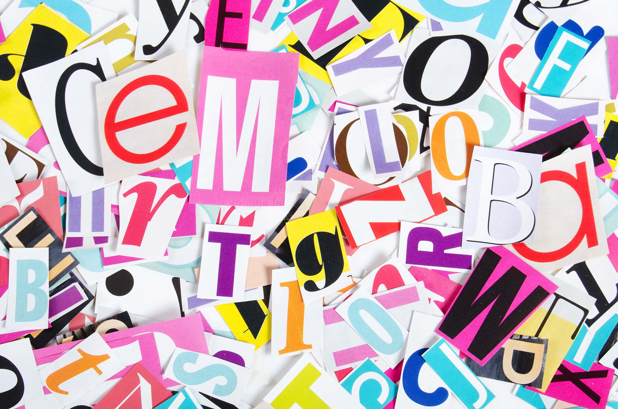
Hang out with any group even casually interested in the aesthetics of communication and the conversation often finds its way to throwing jabs at a font or two. Negative remarks are often delivered with a knowing glance between those in the room who really know (or think they know) typography. Many of us can name these tired but favorite whipping boys.
Among designers, these so-called inferior fonts are treated like the epidemic from Contagion. And among non-designers, a general understanding exists that they’re not supposed to like certain fonts because a designer friends told them so. And if they didn’t hear it from someone directly, there is a dark side of the web, replete with memes and collections of the most egregious typographic sins.
But do fonts like Comic Sans, Papyrus, and Lobster deserve such a bad rap? What did they ever do to become associated with amateur design and poor taste?
It’s far easier to say “this font is good” and “that font is bad” than it is to examine use, intent, and application to make an informed judgment. Mature designers understand that there is no such thing as a bad font. There are only bad uses for fonts.
THERE IS NO SUCH THING AS A BAD FONT. THERE ARE ONLY BAD USES FOR FONTS.
Design is about examining problems and offering solutions, not about adhering to unexamined platitudes, or even about offering up what “looks” best. But inexperience often has no patience for that sort of nuance. Instead of realizing that fonts like Comic Sans have an appropriate, albeit narrow, set of applications, critics denounce their many misuses, throwing them out altogether with the bath water.
Comic Sans, despite its widespread misapplication, was never designed to play a role in the boardroom, on storefront signage, or in PowerPoint slides. It was originally designed as a children’s font, and in context is a clever and appropriate typographic creation.
When I walk into my son’s kindergarten class, I see Comic Sans everywhere. And you know what? I love it. It works. It gives off a youthful, legible-with-levity vibe. And where is that more appropriate than in a room of 5- and 6-year-olds?
It’s not that Comic Sans is a bad font, it’s that folks use it willy-nilly without thought for context. At Colour Outside, we haven’t yet had the privilege of working on a brand that has strategically adopted Comic Sans. But those brands are out there. And maybe one day it’ll make its way proudly into one of our brand concept proposals (but definitely not for the Omohundro Institute, our client who produces leading scholarship on early American history).
C.S. Lewis, the famed mid-20th-century Christian author and intellectual, once delivered this parallel insight regarding context:
“Strictly speaking, there are no such things as good and bad impulses. Think once again of a piano. It has not got two kinds of notes on it, the ‘right’ notes and the ‘wrong’ ones. Every single note is right at one time and wrong at another.”
And every single font is right at one time and wrong at another.
– Justin Schoonmaker