GoGlo

Branding, Packaging, Illustration

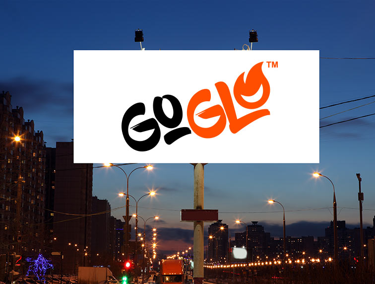
“We want to rename and redesign our product so it truly stands out on store shelves.”

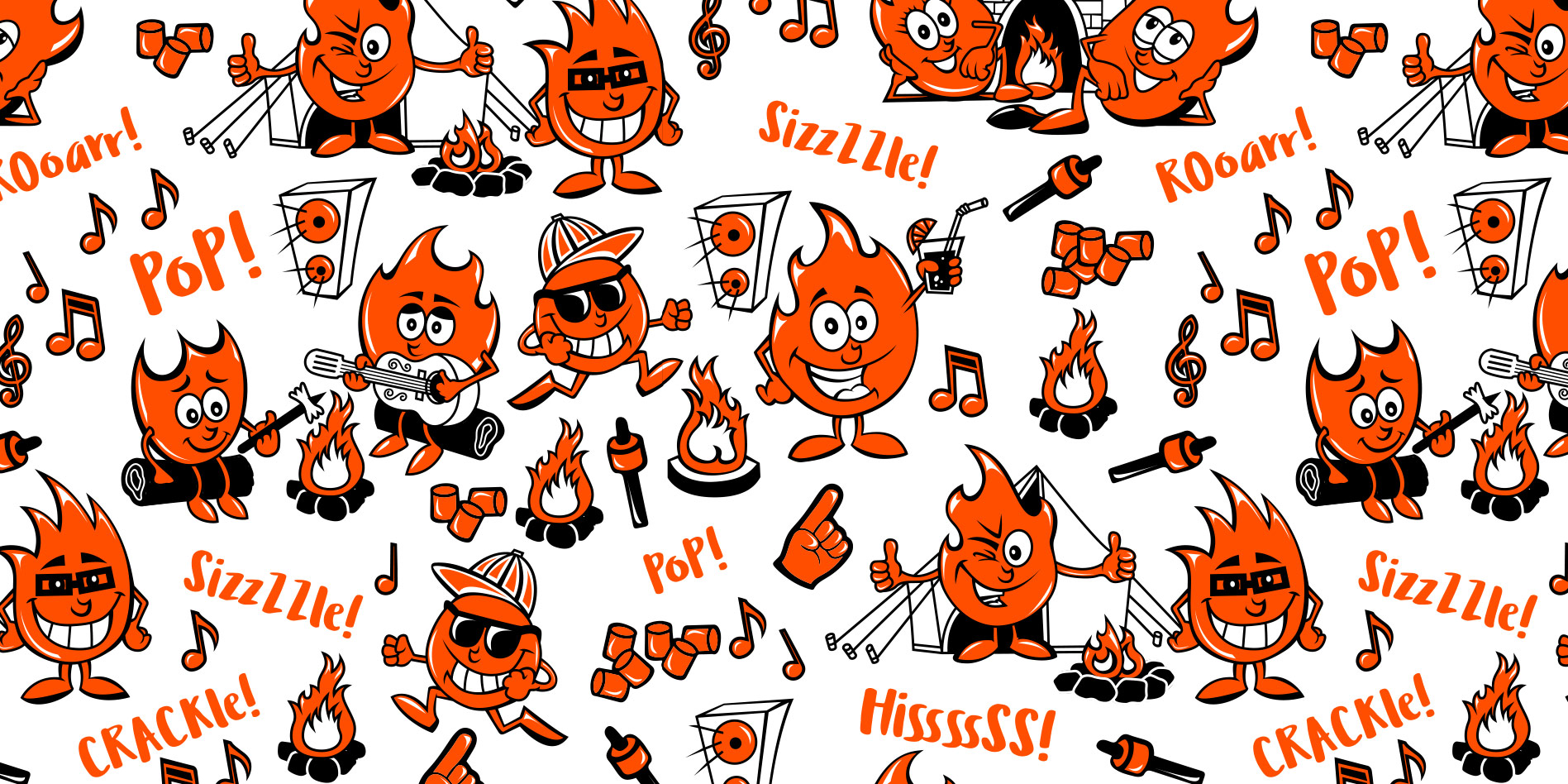
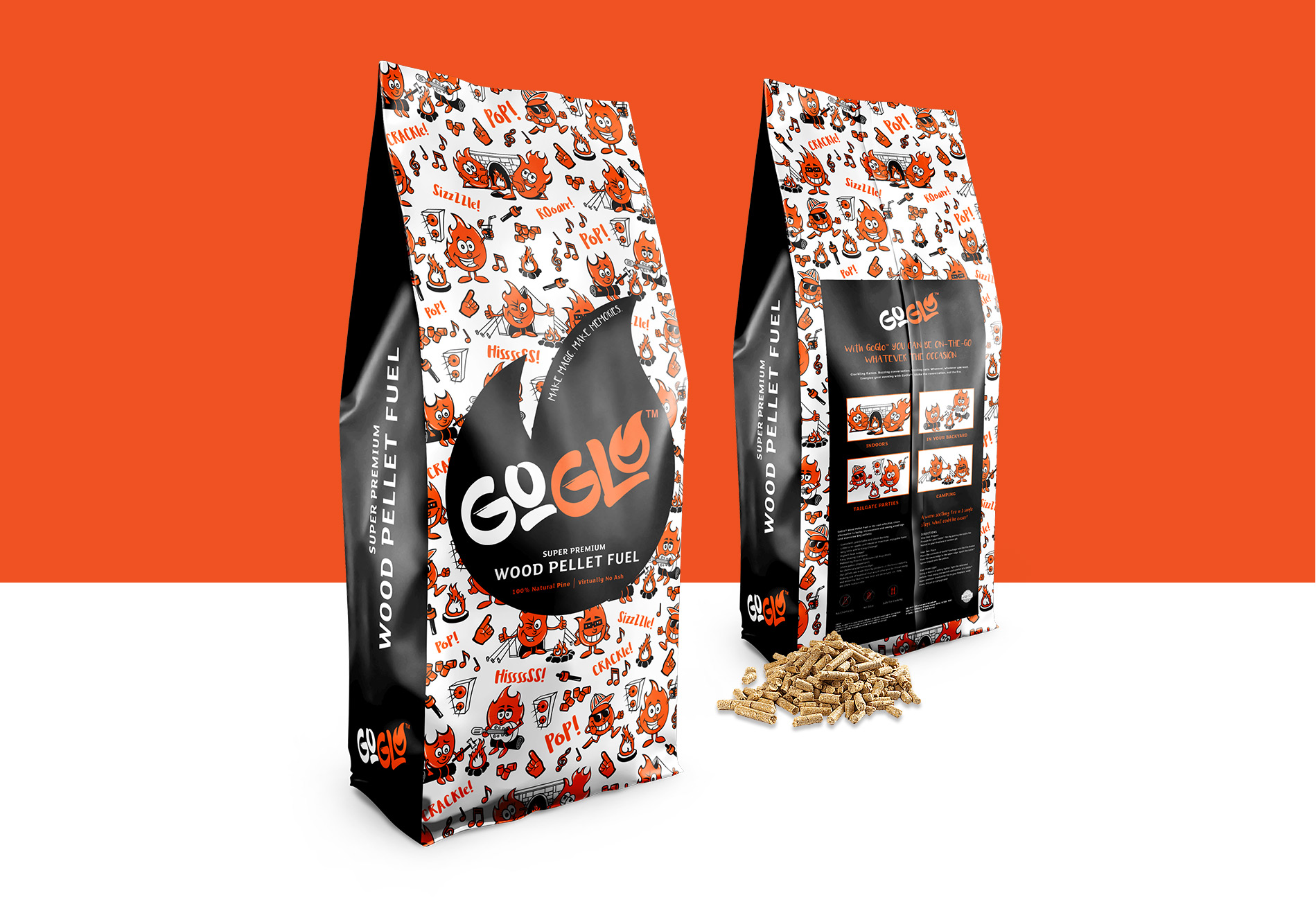
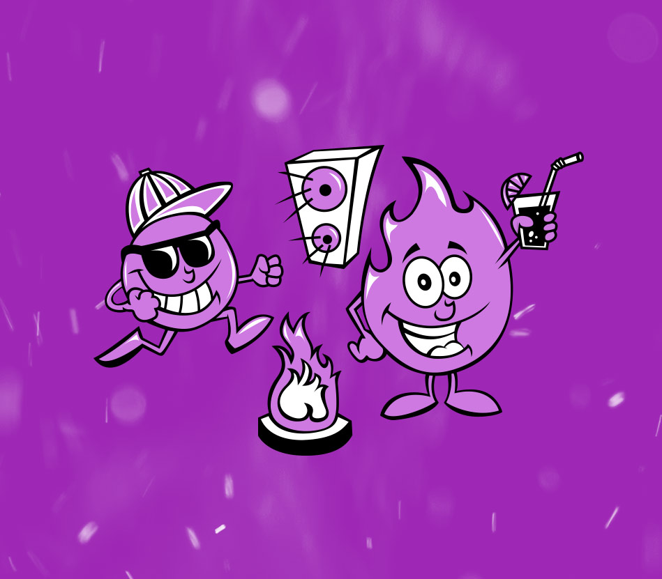
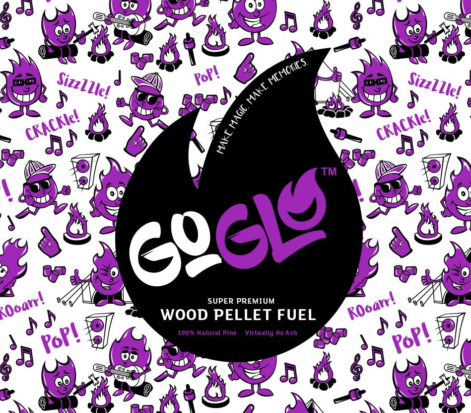
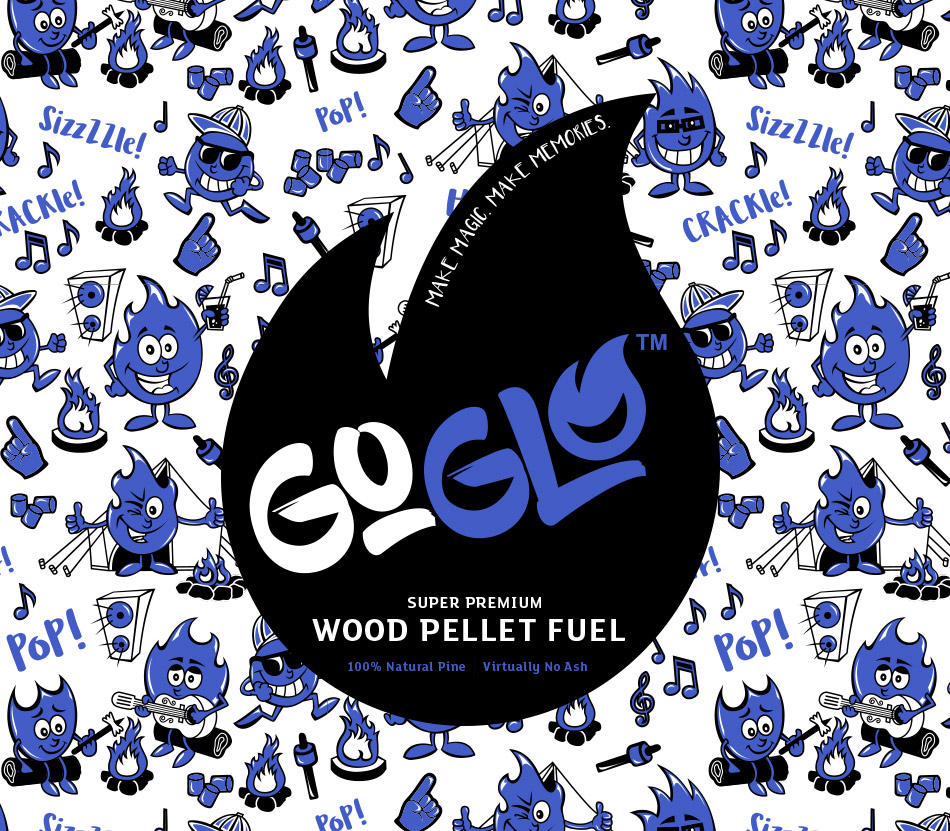
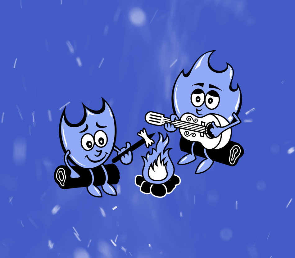
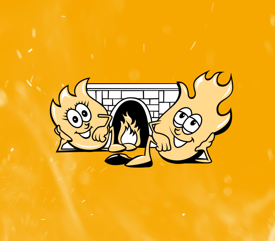
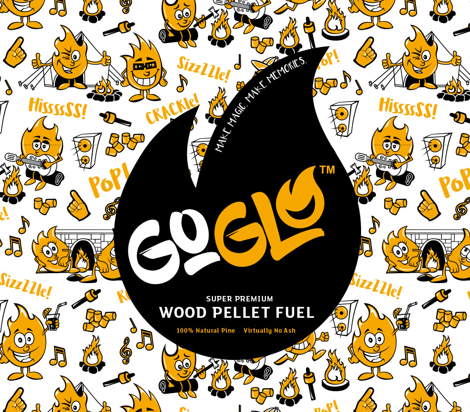
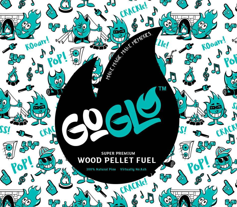
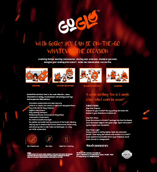
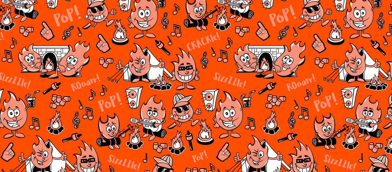
Crackling flames, buzzing conversation, sizzling eats—you can almost feel the heat. GoGlo Wood Pellet Fuel is a cost-effective, clean alternative to bulky and smoky wood logs. They manufacture clean-burning, lightweight pellets that are easily portable, so they’re ideal for both indoors and outdoors.

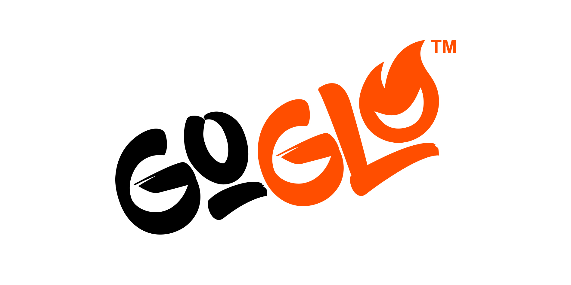
When the client approached Colour Outside, their product was called EasyBlaze. However, they felt their name and package design were boring and a brand overhaul was in order. They were confident that their pellets were unique but they wanted a product that truly reflected this.

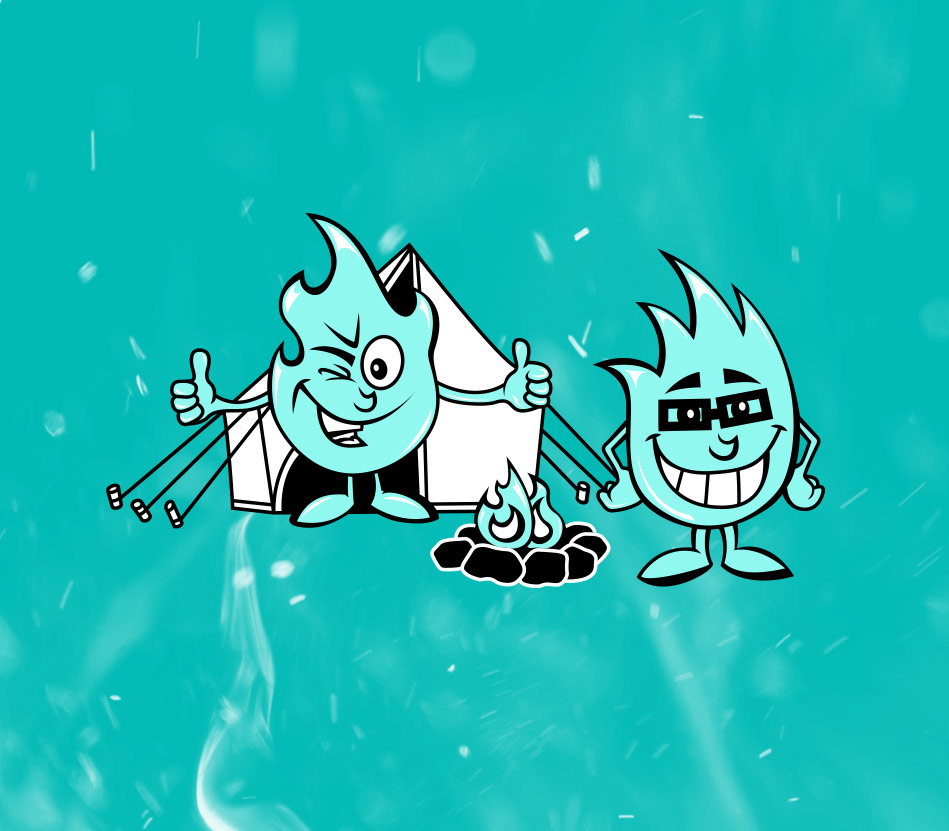
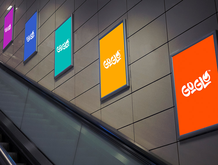
Colour Outside partnered with EasyBlaze to create a memorable brand with quirky illustrations and packaging design that would stand out on store shelves.

Stoke the conversation, not the fire.

This was a unique chance to set our client partner apart from their competition. Based on our market research, we learned that wood pellet brands tend to have bland packaging and emphasize the quality of the wood over the communal experience of a fire. However, why not highlight both? We knew a super convenient product needed an equally convenient name; something concise but memorable.

Our client partner chose GoGlo, from a set of three unique brand identities we prepared (Each identity included a name, messaging, emotional tone, and visual mood board to aid their decision.); the process was truly a collaboration. The name GoGlo is easy to spell and say because of its repeating sounds. The word “go” not only implies convenience but portability, and “glow” conjures images of soothing flames that illuminate the night—a perfect pairing.

Energize your evening with GoGlo.

Our team began experimenting with illustrations of a character smiling inside a ball of fire—a warm, friendly face for the brand. We built their logo around this grinning flame, using it as a stand in for the letter “O.” From there it spun off into a cast of characters—illustrated scenes of fireballs ironically enjoying themselves fireside. We took things even more literally when we included onomatopoeias in the design—Pop! Sizzzle. Rooarr! Our client partner loved how different but approachable the visuals were.