

For the better part of a decade, the design world had a love affair with minimalism.
White space everywhere. Muted tones. Barely-there typography. The less you said visually, the more sophisticated you seemed. Clean was king. And for a while, it worked. Clean design felt modern. Trustworthy. Premium.
Then the internet got very, very clean, and suddenly all those minimal, sophisticated, white-spaced websites started to look exactly the same.
Enter dopamine design. And it’s changing what it means to have a brand that gets noticed.
What Is Dopamine Design?
The term comes from neuroscience — specifically the idea that certain visual stimuli trigger the brain’s reward system, producing a small but real hit of pleasure. Bright colors, high contrast, bold patterns, and playful elements. These choices go beyond aesthetic preference and actually produce a genuine physical response in the viewer.
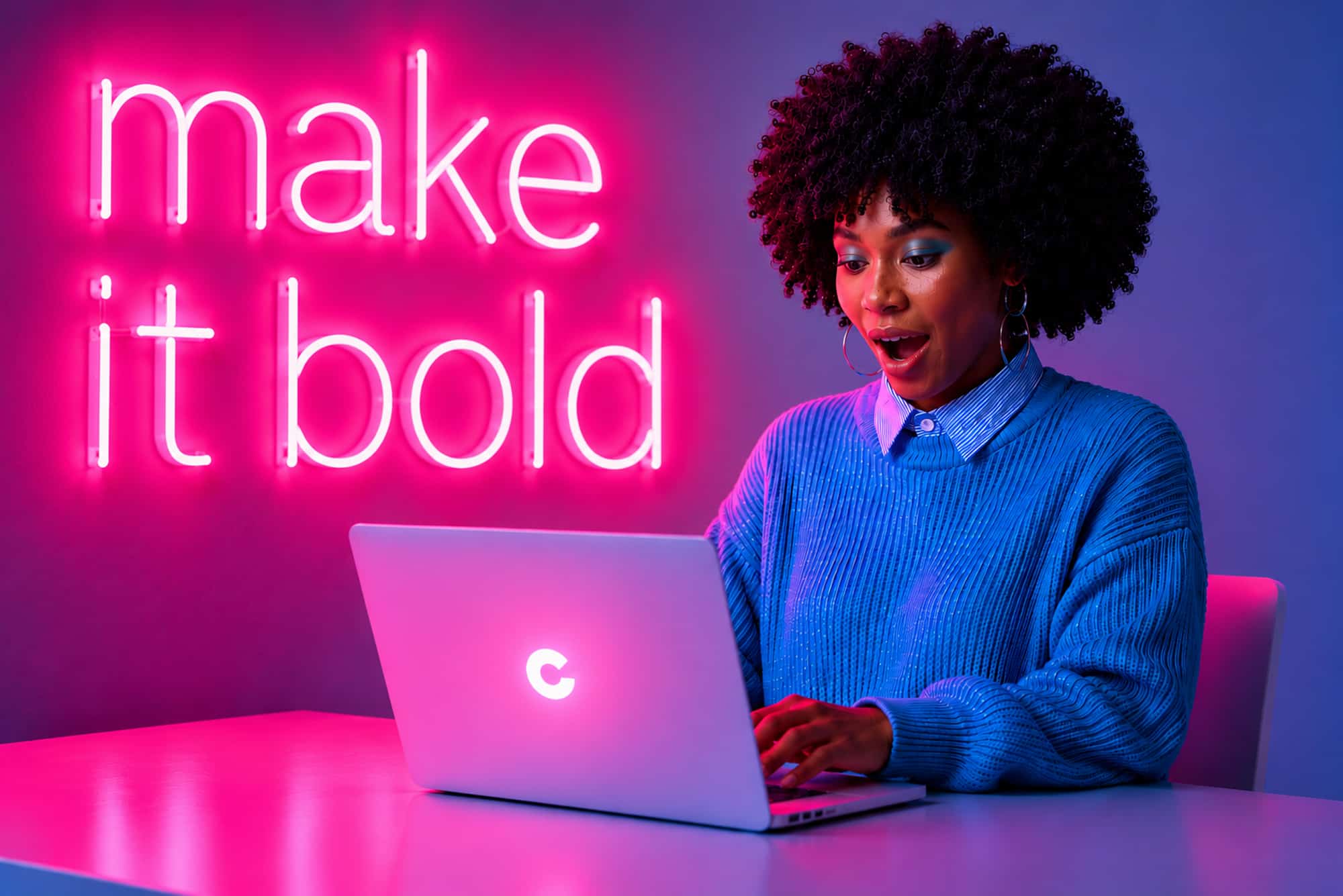
In web design, dopamine design refers to a broad aesthetic trend toward visual boldness: saturated color palettes, vibrant gradients, high-contrast pairings, expressive typography, playful layouts, and design choices that feel joyful rather than restrained. It’s a direct reaction to the sea of beige minimalism that swept through every industry’s branding over the past ten years. Audiences are tired of everything looking the same. They want to feel something when they land on a website.
Why It’s Working
There’s a business case for this, not just an aesthetic one. Attention is the scarcest resource in digital marketing. The average time a visitor spends deciding whether to stay on your website is somewhere between three and eight seconds. In that window, your design is doing the persuading, not your copy. A bold, visually energetic site creates an immediate impression: “This brand has a personality. This brand has confidence. This is worth my time.”
High-contrast, saturated palettes also score well on accessibility metrics, which is increasingly important both ethically and legally as WCAG standards evolve. Good dopamine design isn’t just pretty — it’s readable, navigable, and designed for humans across the full spectrum of visual ability.
There’s also the social media effect to consider. Content that looks distinctive gets shared. A website with a bold, memorable visual identity produces screenshots, reposts, and “did you see this?” moments that a beige website simply doesn’t inspire. Your design is marketing.
Getting It Right
Dopamine design done well is energetic without being chaotic. Here’s where brands tend to find the balance:
- Start with color intentionality. Bold doesn’t mean random. The most effective dopamine-design palettes are deliberate: usually a hero color that’s vibrant and unexpected, paired with carefully chosen contrasts that guide the eye without overwhelming it. The goal is energy with clarity, not chaos.
- Let typography do more work. Expressive type (oversized headlines, unexpected weights, dynamic sizing) is one of the most powerful tools in the dopamine design toolkit. When type has personality, the whole page comes alive without needing a single additional graphic element.
- Use motion with purpose. Subtle animation, hover states, and scroll-driven interactions amplify the dopamine effect without slowing load times or frustrating users. The key word is subtle. Animation should enhance the experience, not perform for its own sake.
- Maintain hierarchy. This is where bold design gets in trouble. A site that’s visually loud but poorly organized confuses users. Dopamine design should feel exciting and intuitive, not exciting and overwhelming. Visual boldness in the wrong places — particularly in the areas where users are trying to find information or take action — works against you.
- Commit to the personality. Half-bold doesn’t work. A site that tries to be both minimal and maximalist ends up looking unresolved. If you’re going to embrace a bolder visual identity, go there. Own it. The brands that do this successfully are the ones that commit.
What This Means for Your Brand
If your website currently lives in the safe center of the design spectrum — clean, professional, and unoffensive — ask yourself an honest question: does it actually look like you? Does it communicate the energy, the personality, and the distinctiveness you want your clients to feel?
If the answer is no, that’s not a cosmetic problem. It’s a brand problem. Because for most of your prospects, your website is the first impression. And “safe and forgettable” is not the impression that wins the business.
Bold isn’t right for every brand. But more brands have the permission to be bolder than they realize. You have more canvas than you think. The question is whether you’re willing to use it.
—
Want a website that actually looks and feels like your brand? Let’s build something bright. Contact us at info@colouroutside.com.