Our Work.
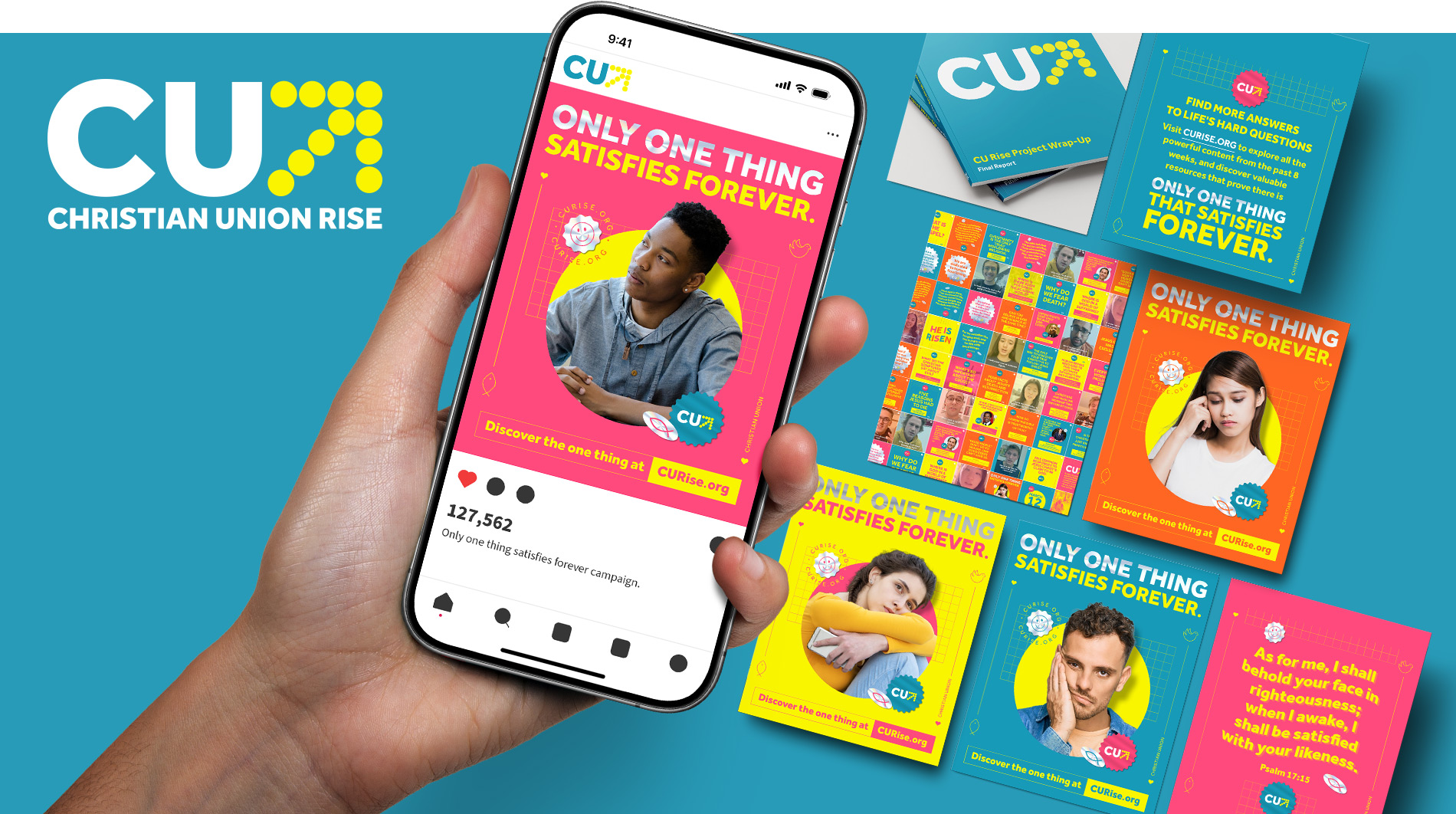
Christian Union
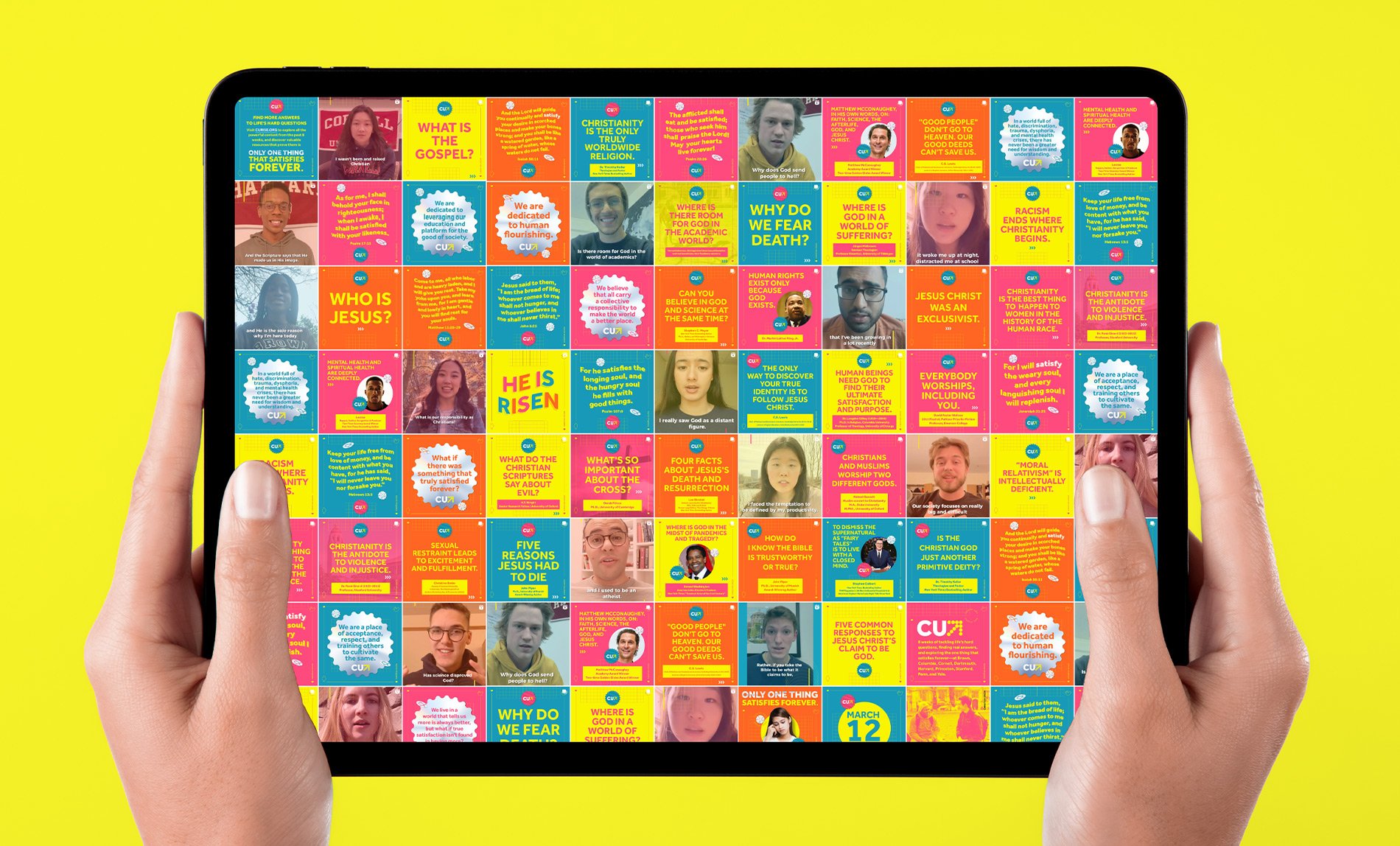
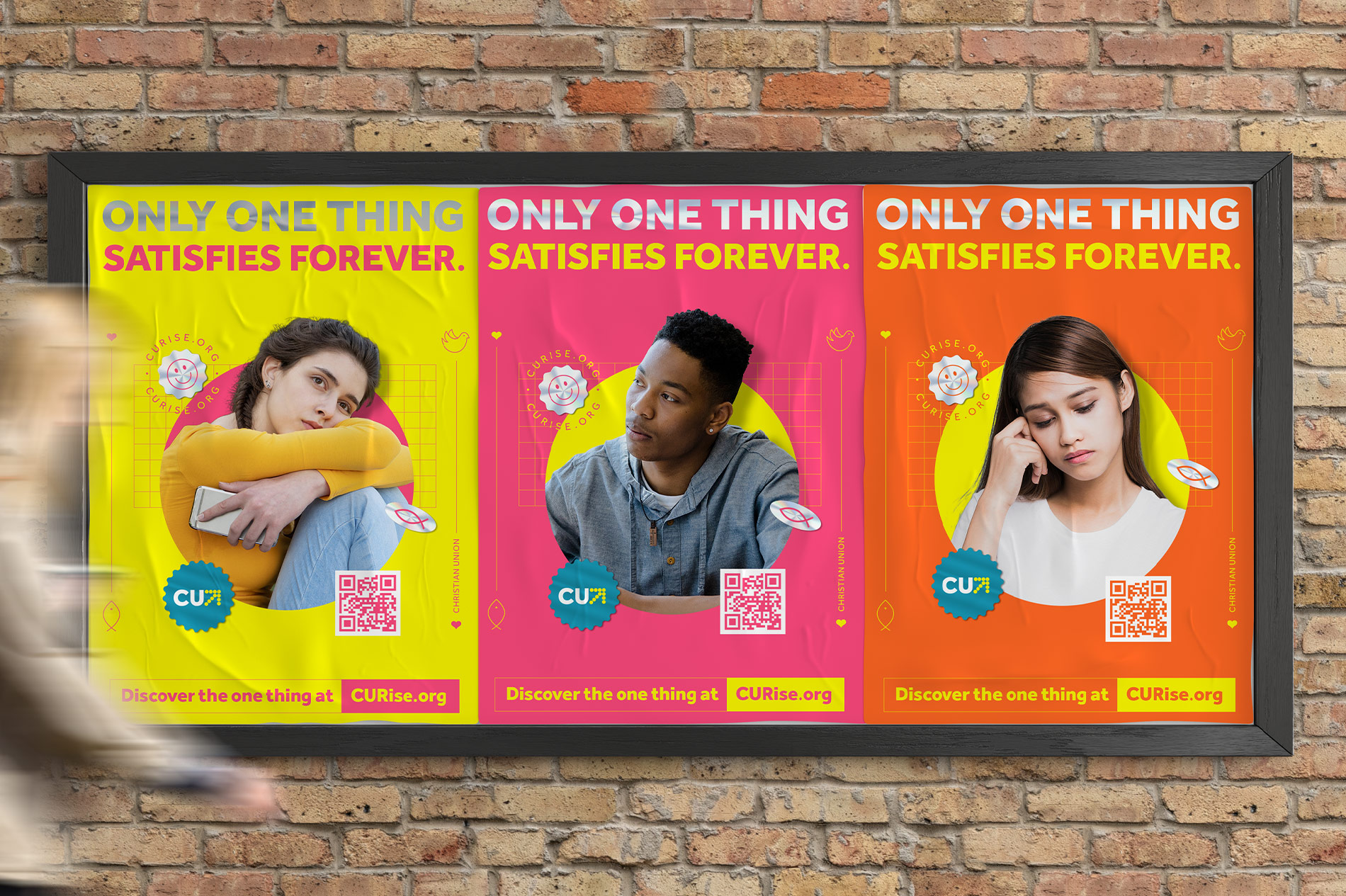
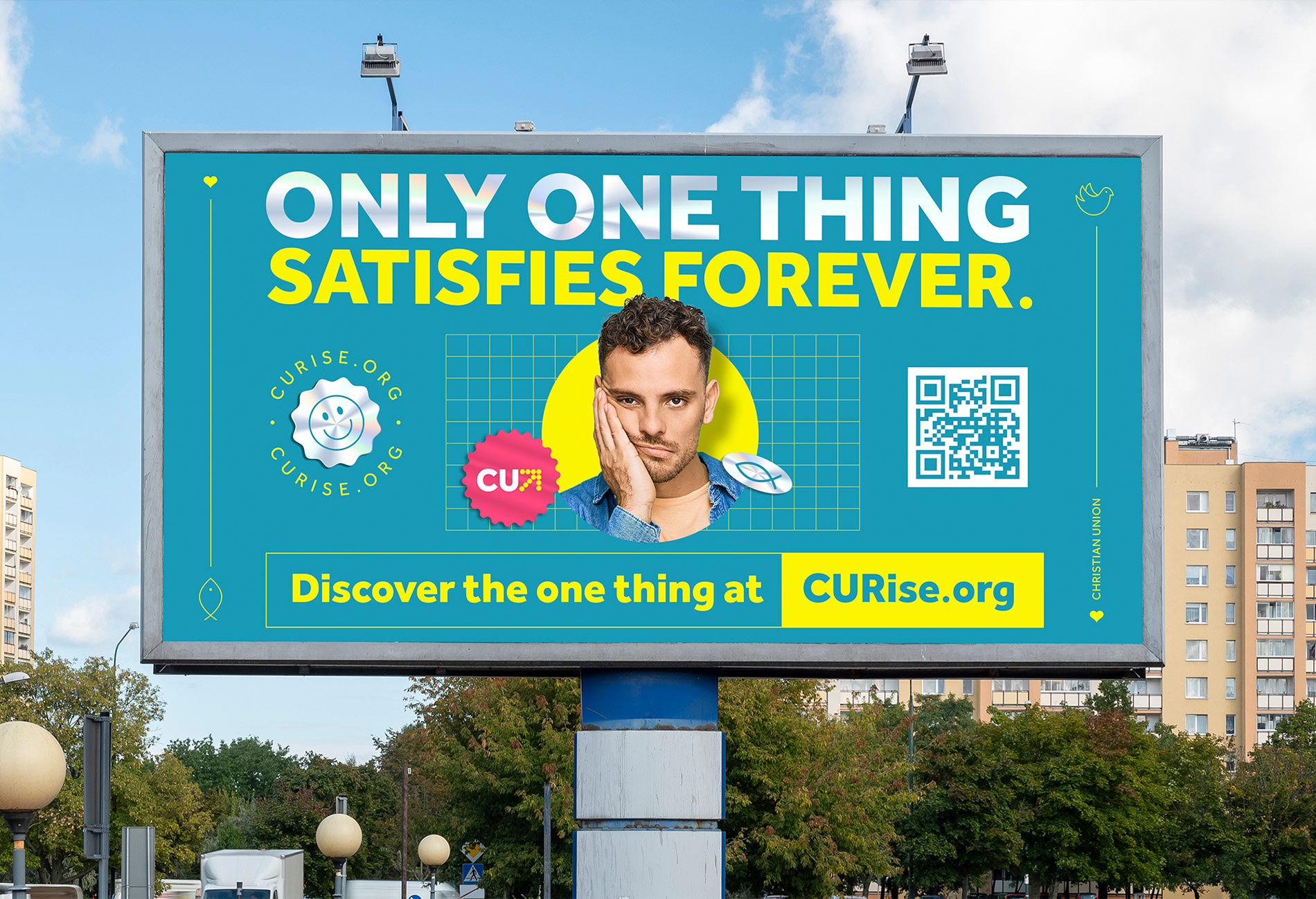
For Christian Union, a non-profit leadership development organization serving students at Ivy League and top universities, Colour Outside partnered on the launch and growth of CU Rise, an eight-week digital initiative created to share the Gospel with college students. Our team built the CU Rise brand from the ground up and led a multi-channel outreach strategy designed to reach students with clarity and intention. The campaign exceeded its original goal of 210,000 gospel exposures, ultimately delivering over 3 million Gospel impressions, including 630,000 through targeted Instagram advertising alone. By extending the campaign beyond social media into 24 campus newspapers, 83 student newsletters, 7 university websites, and 6,500 printed flyers, CU Rise connected with more than 120,000 students across campuses including Harvard, Yale, Princeton, and Stanford.
Life Church
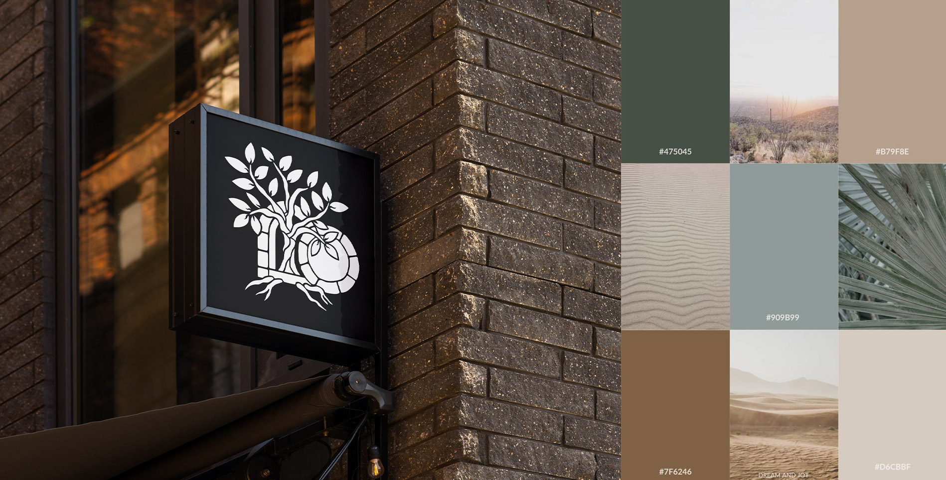
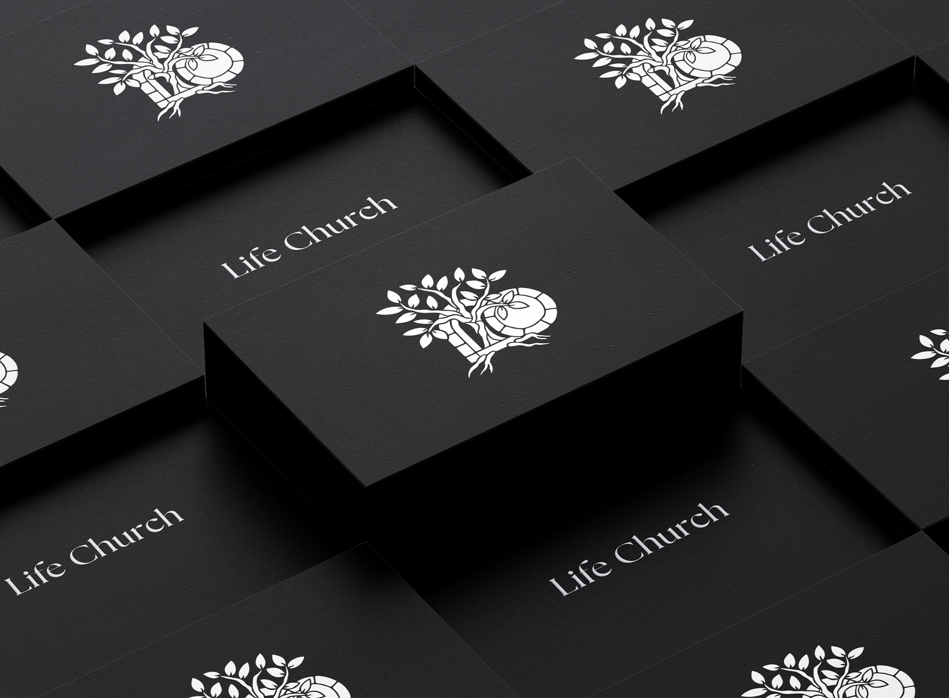
For Life Church, Colour Outside led a rebrand to better reflect the life-giving, Gospel-centered identity of the church. The previous brand felt rigid and overly structured, missing the joy, growth, and personal relationship with Christ at the heart of the community. Our approach focused on stripping away what was unnecessary and returning to what is essential. The new visual identity draws from natural earth and water tones, creating a sense of peace, renewal, and grounded faith. The logo centers on a tree — a Biblical symbol of growth and flourishing in Christ — while stone shapes reference the stone rolled away from the tomb, proclaiming the resurrection of Jesus and the new life found in Him. Together, the rebrand communicates a church rooted in Scripture, alive in faith, and growing in Christ.
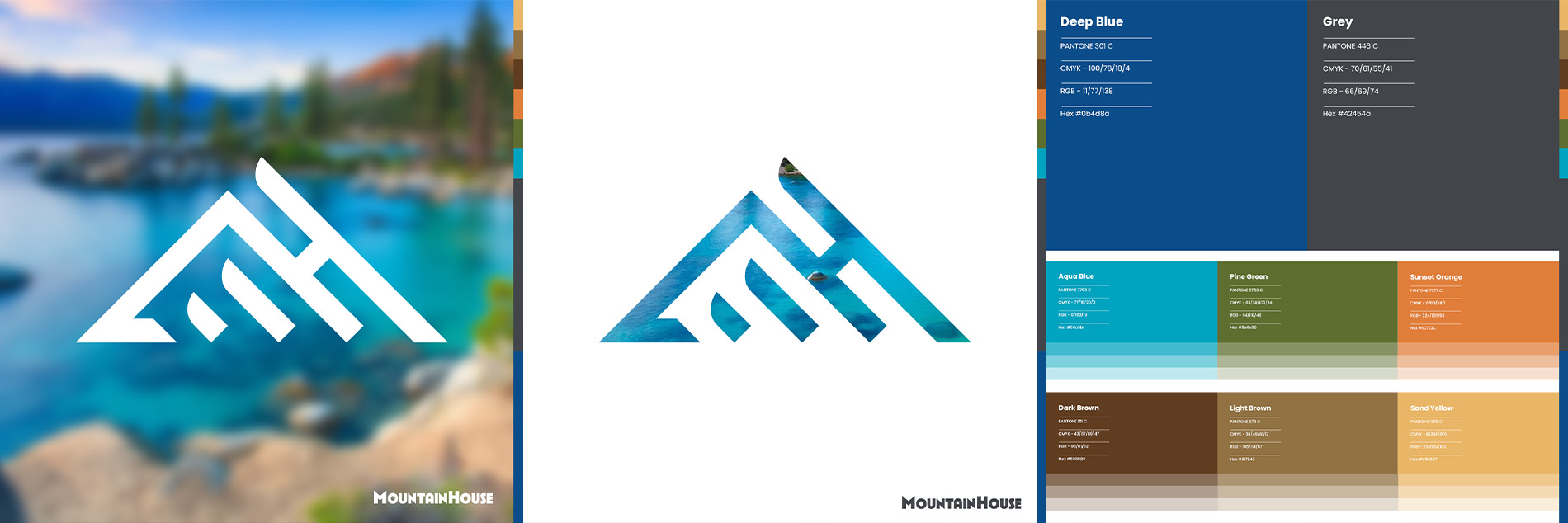
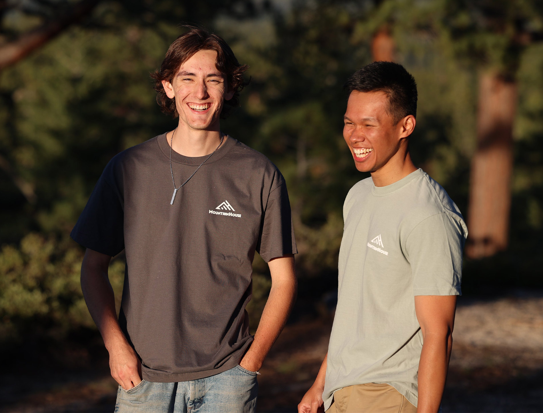
MountainHouse
Lake Tahoe Christian Fellowship approached Colour Outside as they prepared to celebrate their 50th anniversary and step into a new season with a new name: MountainHouse. The church needed a logo and visual identity that honored its history while clearly expressing where God was leading next. Drawing inspiration from the natural beauty that surrounds the South Lake Tahoe community, we developed a color system rooted in the region’s clear blue water, evergreen forests, native plants, and vivid sunsets. Mountains carry deep Biblical significance as places of encounter, perspective, and drawing closer to God, and that meaning shaped the identity throughout. The logo reflects the area’s topography, with the MH initials hidden in plain sight, symbolizing faith that is both grounded and growing. A primary typeface inspired by Tahoe’s history as a ski destination adds warmth and timelessness. The result is a brand that feels true to the place, rooted in Christ as the solid foundation, and inviting the community to ascend closer to God together.ing the community to connect with God through His creation and grow closer to Him together.
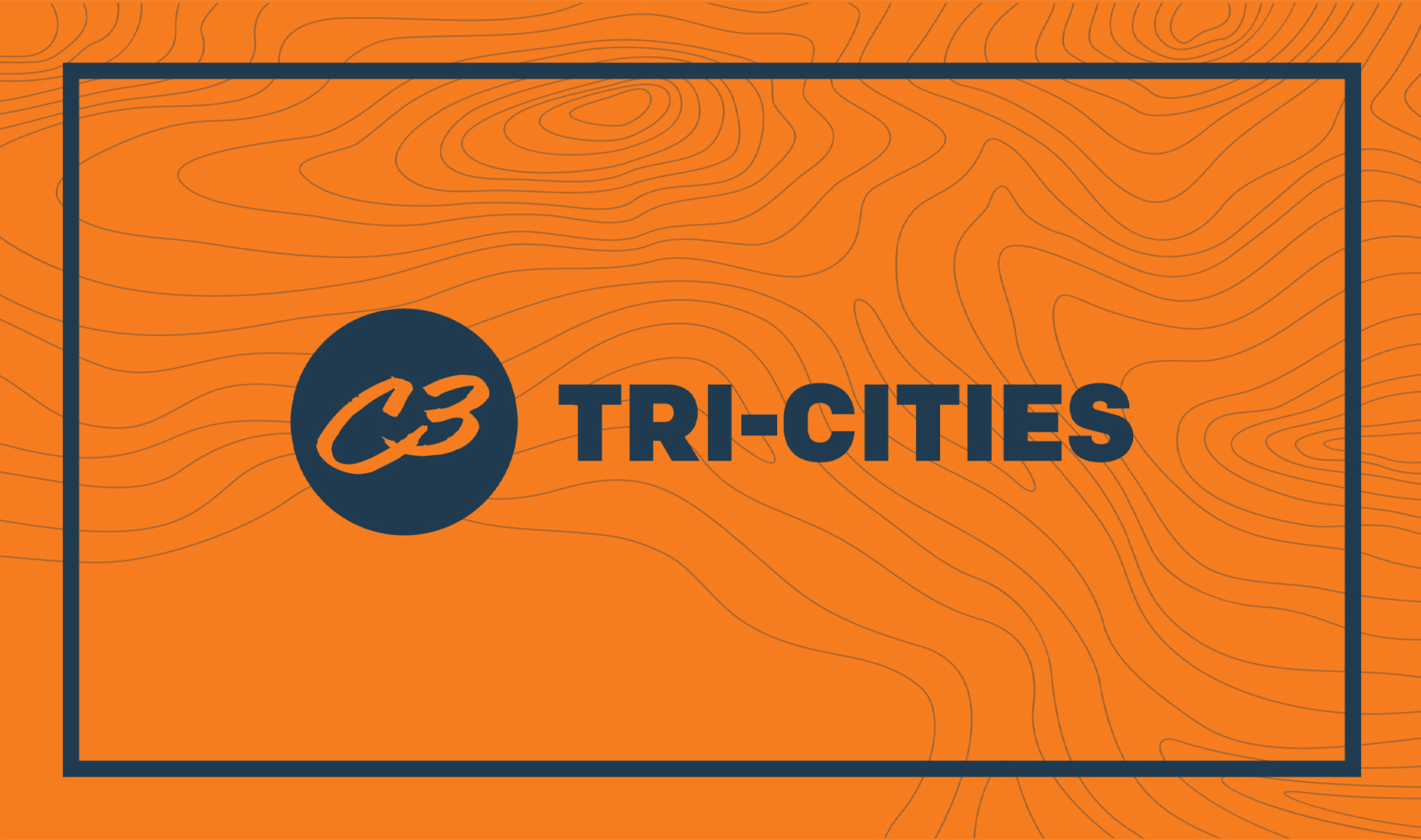
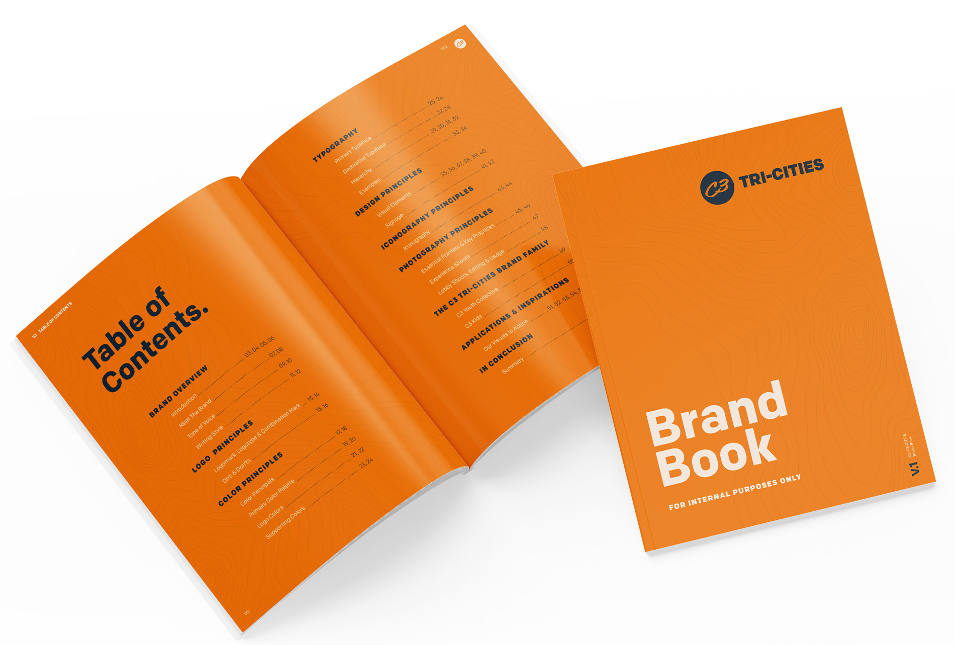
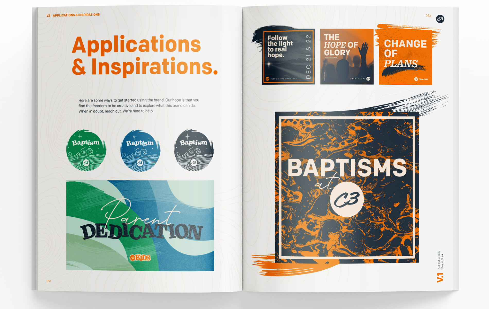
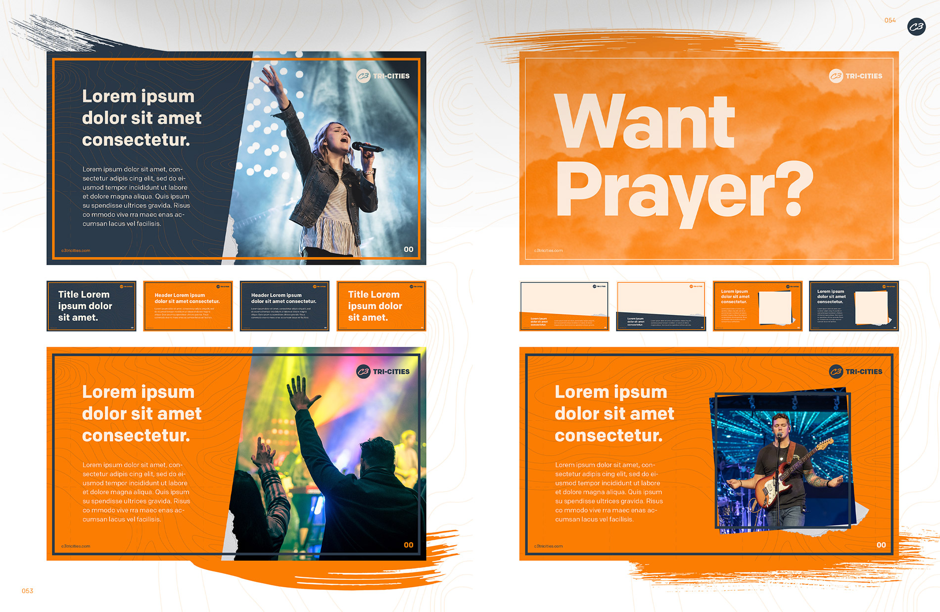
C3 Tri-Cities
For C3 Tri-Cities Church, Colour Outside helped bring clarity and cohesion to how the church expresses its brand across digital and in-person spaces. While the core logo and colors remained in place, our work focused on creating a clear visual system that felt modern, vibrant, and true to the church’s identity. We developed a brand guide and a flexible set of design templates for social media, screens, and announcements, giving the team tools they could use consistently and confidently. The visual language incorporates topographic elements inspired by the Tri-Cities region, pointing to themes of navigation, perspective, and walking life’s path with God. Organic textures, movement, and bold typography add energy and warmth, reflecting a church that is Spirit-led, welcoming, and alive in faith. The result is a cohesive, expressive presence that highlights worship, community, and the Word, inviting people of all ages to feel drawn in and connected.
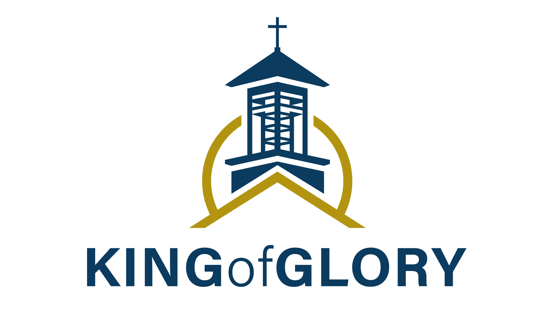
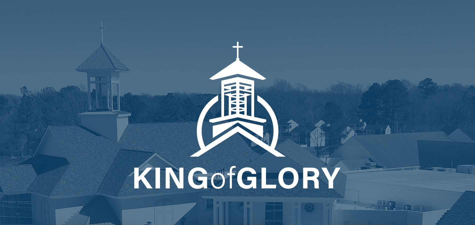
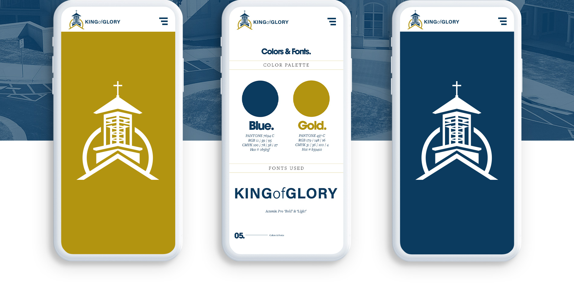
King of Glory
For King of Glory Lutheran Church and School, Colour Outside partnered on a brand refresh that honored more than 30 years of worship, education, and service in the Williamsburg community. Central to the identity is the church’s iconic cupola, which sits atop the sanctuary and has long served as a visible beacon to the surrounding area. That familiar landmark became the foundation for the new logo, symbolizing light, welcome, and God’s presence in the community. Our work focused on modernizing the brand through clean lines and a refined typeface, while preserving the traditional colors and character that reflect King of Glory’s history. The result is a confident, timeless identity that respects the past while clearly supporting the church’s mission for the future.
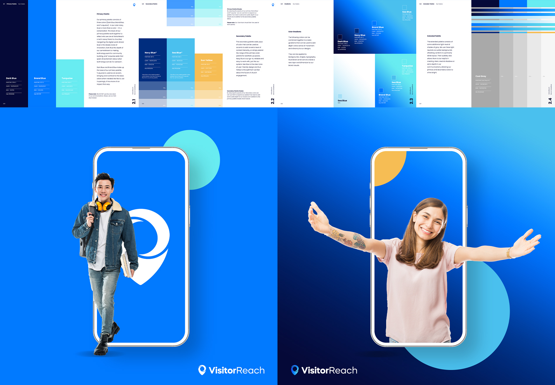
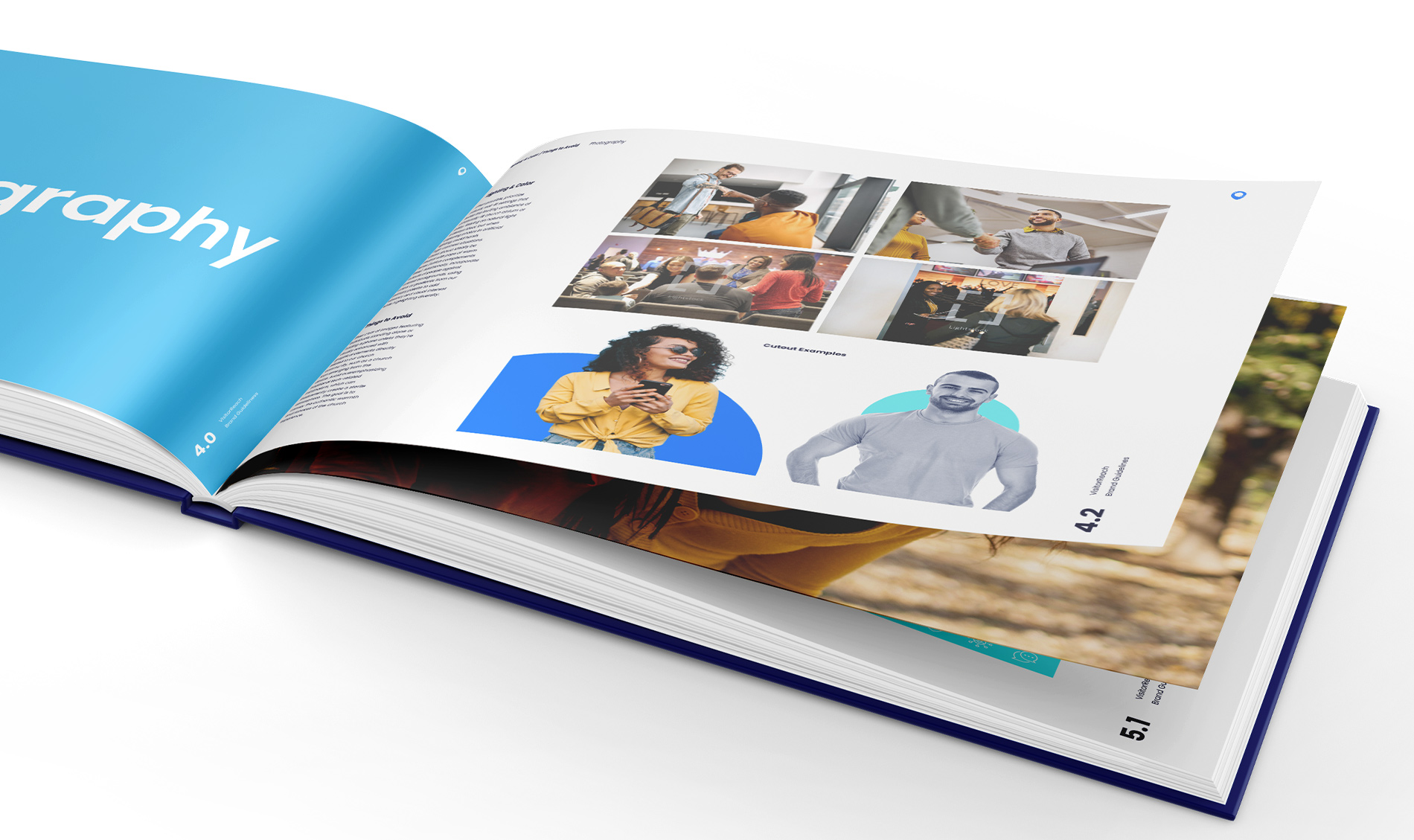
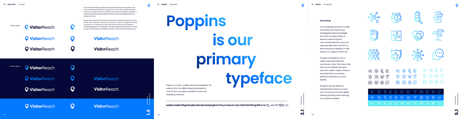
Visitor Reach
For VisitorReach, a digital platform helping churches connect more meaningfully with people seeking a spiritual home, Colour Outside developed a comprehensive brand system to bring clarity, warmth, and consistency across every touchpoint. Our work focused on translating a technology-driven product into a brand that feels personal, welcoming, and rooted in community. Through a clear logo system, thoughtful color palette, flexible typography, and a cohesive visual language, we helped VisitorReach express its mission with confidence and approachability. Photography and design guidelines centered on real moments of welcome, worship, and belonging; reflecting the heart of church life rather than sterile tech aesthetics. The result is a brand that supports churches in sharing the Gospel through connection, hospitality, and invitation, while giving VisitorReach a recognizable, trusted presence in the faith-based digital space.